You are using an out of date browser. It may not display this or other websites correctly.
You should upgrade or use an alternative browser.
You should upgrade or use an alternative browser.
Illinois Football Uniforms
redwingillini11
White and Sixth
- North Aurora
Would prefer white pants, but this is a solid look. Sure as heck looks better than the look Kansas had when we played them last year.
lstewart53x3
- Scottsdale, Arizona
Fire
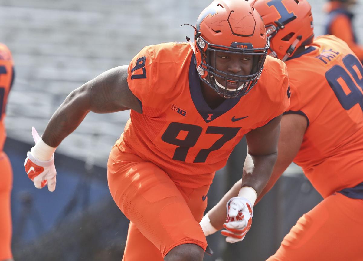
The triple helmet stripe really makes the shoulder stripes pop
All orange. My least favorite combo by a mile.
The triple helmet stripe really makes the shoulder stripes pop
IlliniKat91
- Chicago, IL
I'm curious, what color did you think they'd be wearing when they've been calling for an orange out?I had such high hopes for this game.... not happy about thechoice of uni's...

I think we are wearing the best helmet design this game
It's funny, when we wore the slant ILLINOIS I absolutely hated it and couldn't wait to lose it.I think we are wearing the best helmet design this game
Now that I see it again a few years later, I really like it. I never, ever thought I'd say that.
Same here. It's basically the Nickelback of football helmets.It's funny, when we wore the slant ILLINOIS I absolutely hated it and couldn't wait to lose it.
Now that I see it again a few years later, I really like it. I never, ever thought I'd say that.
Fighter of the Nightman
- Chicago, IL
POTDSame here. It's basically the Nickelback of football helmets.

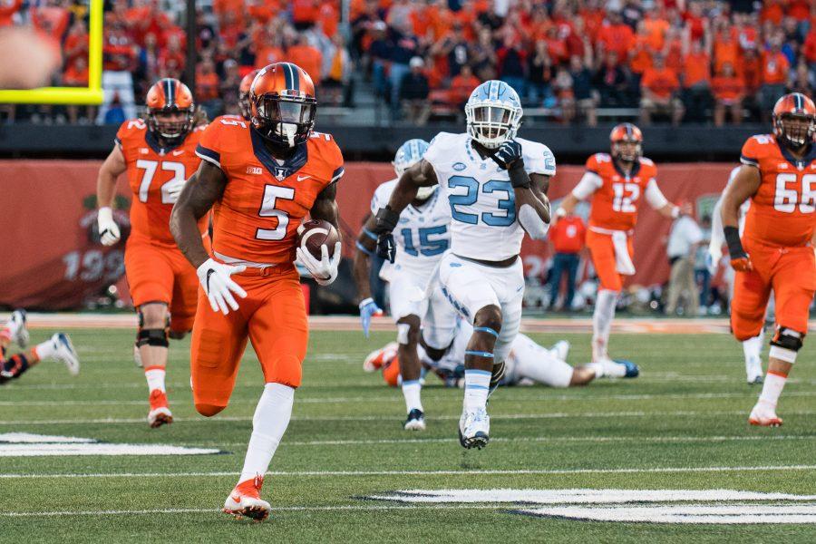
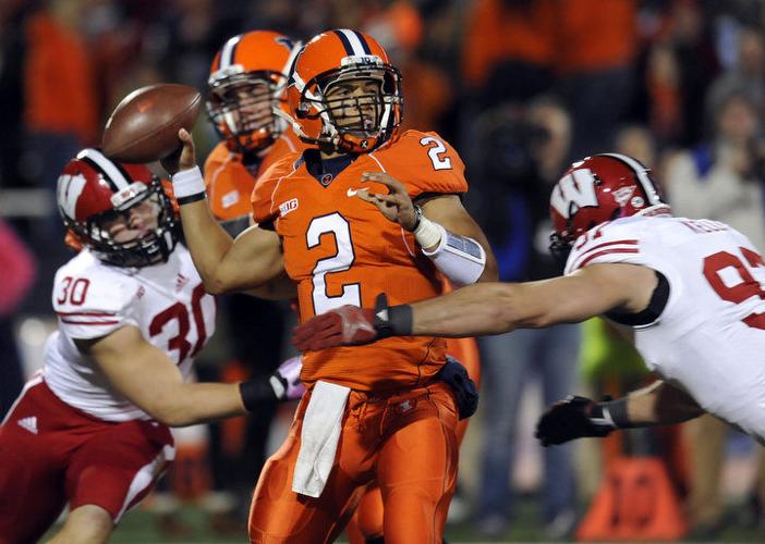
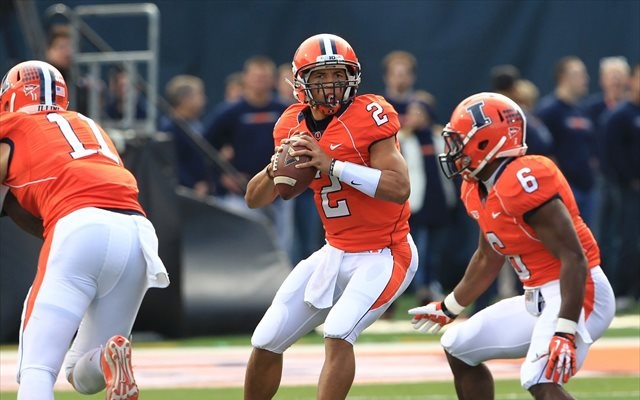
The uni in that second Lovie-era pic is a mess.Here is a comparison of some of our past orange jerseys with orange pants vs. white pants that I could find. While I simply just dislike some of the uniforms altogether (lookin' at you, Lovie Era), I don't think the orange pants look better in a single iteration.
LOVIE ERA

BECKMAN ERA
:format(jpeg)/cdn.vox-cdn.com/uploads/chorus_image/image/49271063/usa-today-8068505.0.jpg)
ZOOK ERA
I appreciate people who hated that we wore white pants at home in the Zook Era and that we wear white pants on the road a ton now ... I am sympathetic to the argument that our "regular/traditional look" should be O/B/O and O/W/O, period. However, if we are going to throw in an orange jersey ... the orange pants are just too much, lol.
redwingillini11
White and Sixth
- North Aurora
I think having the letters not outlined in blue really helps. The blue outline kind of muted the helmet, when combined with an ancient 2005 Nike template, really made us look like we had a stale look during the post-Rose Bowl years. Better jerseys and a white-only Illinois really pops and is a much better look than what we had circa 2012.It's funny, when we wore the slant ILLINOIS I absolutely hated it and couldn't wait to lose it.
Now that I see it again a few years later, I really like it. I never, ever thought I'd say that.
Fighter of the Nightman
- Chicago, IL
I have become almost as much of a broken record on this as with my hatred of the Horseshoe, but I honestly hated those uniforms so much.The uni in that second Lovie-era pic is a mess.
 Again, I have beaten this horse to death ... but they were the worst of both worlds. Had nothing traditional/classic about them, and yet they were astonishingly boring. They epitomized what I saw as Nike's lowest possible single effort to cash in on a very unfortunate minimalist trend that is thankfully beginning to die.
Some are better than others in that era, but I think they all are way worse than everything that came before them and what we have now. I'd probably rank them like this from most aesthetically pleasing to least, of the endlessly random combos we used during that era:
/cdn.vox-cdn.com/uploads/chorus_asset/file/19263206/usa_today_13467676.jpg)
/cdn.vox-cdn.com/uploads/chorus_image/image/61438167/1025946838.jpg.0.jpg)

/cdn.vox-cdn.com/uploads/chorus_image/image/65132690/usa_today_11636047.0.jpg)
/cdn.vox-cdn.com/uploads/chorus_image/image/61501535/1037545996.jpg.0.jpg)
Those jerseys were SO plain and cheap looking that the only combinations that even kind of worked involved non-traditional color schemes of ours so that we could incorporate orange, blue and white in appropriate quantities. Especially our road uniforms in those with an orange number on a white jersey with no navy outline just looked so bad to me, haha.
GrayGhost77
- Centennial, CO
Hate the all orange. Hate the ILLINOIS helmets. If we win, maybe I'll hate them a little less, but not by much. Hopefully the next game's uni combo will be better.
I love orange, but the all orange combo is not my favorite, tbh.I had such high hopes for this game.... not happy about the
Imo Illinois has always struggled with having any sort of brand or identity around the football program. Uniforms are constantly changing and there aren't many strong traditions around game time. Reestablish the arch illini, get rid of the vertical shoulder stripes, and just leave it forever.
OrangeBlue98
- Des Moines, IA
Maybe it's just too much, but I'd like to see one game with orange jerseys and blue pants. Maybe it wouldn't look good because of the orange helmet, but I'd like to at least try it. I always liked the Turner-era O/W/B on the road, but maybe that's just me still screaming at Rocky Harvey to take a knee at the Big House instead of completing his touchdown run.All orange looks like the Fighting Carrots.
My take on visuals: Bright colors look nearer and bigger. Dark colors recede and look smaller. So if you want the Big John “sorta broad in the shoulders and narrow in the hips” look, Orange jersey, Blue pants.
Add that Orange will be easier for a quarterback to track. Pass defense, does Orange look more intimidating or does it give more information to the opposing QB about where the defense is?
Either way, I’d go Orange helmets every time, all the time.
Put me in the tight... white pants club.Would prefer white pants, but this is a solid look. Sure as heck looks better than the look Kansas had when we played them last year.
mattcoldagelli
- The Transfer Portal with Do Not Contact Tag
When I am made President of Illinois Football Aesthetics, we will never ruin a great throwback helmet by going monochrome uniform.
White pants....I'm curious, what color did you think they'd be wearing when they've been calling for an orange out?
Arched illini helmet is our best one, butkus era right behind it. Would love if we made either our permanent lids going forward, or throw the butkus stars over the block I - home run
Perhaps it just me. I have no Illini top (tee shirt, golf shirt, etc.) with orange as the base color. Navy blue all the way.Hate the all orange. Hate the ILLINOIS helmets. If we win, maybe I'll hate them a little less, but not by much. Hopefully the next game's uni combo will be better.