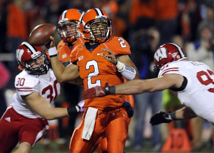
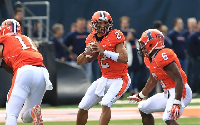
Illinois Football Uniforms

#101      
I agree that Orange-Orange-White is our best use of white pants. My ideal rotation is:

O-B-O
O-B-B
O-O-W
O-W-O
O-W-B
Yeah, I hate the white pants on the road ... but I think with the orange helmet and orange jersey, given the B/O/B striping on the white pants, it would look really slick.

EDIT: I now remember that someone posted it in one of the old threads about the new EA College Football 25 game!

img_1156-jpeg.35814

Yeah, I just think that looks better than all orange.
 
#102      
Yeah, I hate the white pants on the road ... but I think with the orange helmet and orange jersey, given the B/O/B striping on the white pants, it would look really slick.

EDIT: I now remember that someone posted it in one of the old threads about the new EA College Football 25 game!

img_1156-jpeg.35814

Yeah, I just think that looks better than all orange.
all orange is NOT a good look .
 
#104      
We could be "The Great Pumpkins" and have a Pumpkin day promotion. Or, maybe not...
yea

I forget what game it was , and it was in the last two years , that we were all orange and it did not look good .
 
#108      
One positive is it reminds me of Robert Holcombe (and second, Kurt Kittner). That alone is worth something. Holcombe took a beating and just kept on trucking.
never liked the slanted illinois, or illini in a radius. made no sense. at least the block I is a iconic symbol. unmistakable.
 
#111      
never liked the slanted illinois, or illini in a radius. made no sense. at least the block I is a iconic symbol. unmistakable.
I think I liked the Illini in radius most because we won the most when we wore it in 1980s. Late 80s we wore the slant Illinois but the Illini in radius covered our best years.
 
#114      
My brother saw us in all orange last year. He said we looked like popsicles. (He's a Wisconsin grad, FWIW.)
My problem with any bright-colored pants matching the jerseys is that they look like pajamas! The KC Chiefs wearing all red, for example, just looks ridiculous.

I don't feel this way about dark colors so much, and our O-B-B is my favorite ever and I will not be told otherwise! (Same for da Bears' B-B-B.)
 
#115      
In logo design, you want to find something you have that is unique and distinctive and build on that.

I always thought the word “Illini” had potential because it’s almost entirely vertical sticks.

ILLINI is pretty close to IIIII\II

I always thought there must be a way to take all that straight line verticality and stylize it into something that would pop visually.

The arched Illini logo emphasizes those up-down lines which is why I think it’s the best of all of them from an aesthetic viewpoint.
 
#116      
never liked the slanted illinois, or illini in a radius. made no sense. at least the block I is a iconic symbol. unmistakable.
I know the whole Syracuse thing has been beaten to death, but I was watching the College Gameday intro looking for any appearance of the Beloved. I thought I had found one, where a player in orange and blue was doing like a backflip or something. And I had to Zapruder film the half second clip to try to confirm it was an Illinois player, but my final conclusion was that it was a Syracuse player. It just looked so similar in a blur.

Bottom line, the blue Block I on an orange helmet looks a lot like a blue block S on an orange helmet from afar. When I get made dictator AD, I am saying we rotate through Illinois, arched Illini, and Block I throughout the season, with maybe the star and numbers helmet used once a year.

P.s. IMO, the arched Illini is our best helmet for our home blues, and Illinois is our best helmet for our road whites and our orange jersey.
 
#119      
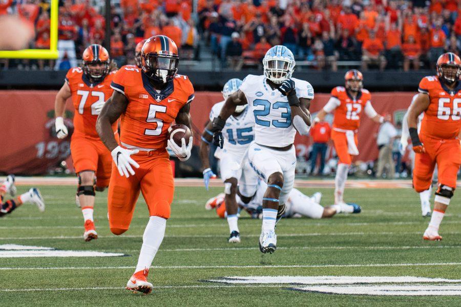
Here is a comparison of some of our past orange jerseys with orange pants vs. white pants that I could find. While I simply just dislike some of the uniforms altogether (lookin' at you, Lovie Era), I don't think the orange pants look better in a single iteration.

LOVIE ERA
Illini-Bobby-Roundtree-action-Illinois-athletics.jpg

1*7LBosG6yOH_IzvNbfaADXw.jpeg


BECKMAN ERA
QS2_2516-900x600.jpg

usa-today-8068505.0.jpg


ZOOK ERA
5d07c1bb9dc72.image.jpg

scheelhaase-father-arrest.jpg


I appreciate people who hated that we wore white pants at home in the Zook Era and that we wear white pants on the road a ton now ... I am sympathetic to the argument that our "regular/traditional look" should be O/B/O and O/W/O, period. However, if we are going to throw in an orange jersey ... the orange pants are just too much, lol.
 
#120      
Here is a comparison of some of our past orange jerseys with orange pants vs. white pants that I could find. While I simply just dislike some of the uniforms altogether (lookin' at you, Lovie Era), I don't think the orange pants look better in a single iteration.

LOVIE ERA
Illini-Bobby-Roundtree-action-Illinois-athletics.jpg

1*7LBosG6yOH_IzvNbfaADXw.jpeg


BECKMAN ERA
QS2_2516-900x600.jpg

usa-today-8068505.0.jpg


ZOOK ERA
5d07c1bb9dc72.image.jpg

scheelhaase-father-arrest.jpg


I appreciate people who hated that we wore white pants at home in the Zook Era and that we wear white pants on the road a ton now ... I am sympathetic to the argument that our "regular/traditional look" should be O/B/O and O/W/O, period. However, if we are going to throw in an orange jersey ... the orange pants are just too much, lol.
Never wearing orange tops again is a worthy sacrifice for never wearing white pants again. I make that trade 100% of the time. White pants at home, when you have 2 primary colors that aren't white, is an SEC thing (LSU, UF, Ole Miss, UGA). I much prefer to be decked out in both primary colors with white as an accent only. Every time I heard the comment "White pants make us look faster" I felt like beating myself in the temple with a hammer.
 
#121      
Never wearing orange tops again is a worthy sacrifice for never wearing white pants again. I make that trade 100% of the time. White pants at home, when you have 2 primary colors that aren't white, is an SEC thing (LSU, UF, Ole Miss, UGA). I much prefer to be decked out in both primary colors with white as an accent only. Every time I heard the comment "White pants make us look faster" I felt like beating myself in the temple with a hammer.
I agree with navy or white jerseys … but I strongly disagree with ever wearing orange or navy pants with orange jerseys, lol. I guess we can agree to your sacrifice scenario!!
 
#125      
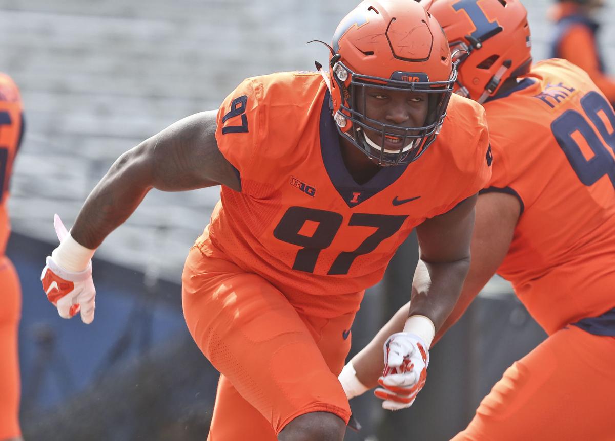
All orange looks like the Fighting Carrots.

My take on visuals: Bright colors look nearer and bigger. Dark colors recede and look smaller. So if you want the Big John “sorta broad in the shoulders and narrow in the hips” look, Orange jersey, Blue pants.

Add that Orange will be easier for a quarterback to track. Pass defense, does Orange look more intimidating or does it give more information to the opposing QB about where the defense is?

Either way, I’d go Orange helmets every time, all the time.
 
Back