Yes! A thousand times yes!Just make these the helmets
You are using an out of date browser. It may not display this or other websites correctly.
You should upgrade or use an alternative browser.
You should upgrade or use an alternative browser.
Illinois Football Uniforms
GrayGhost77
- Centennial, CO
They listened! I love it.I'd be down with that but also wouldn't mind seeing O/B/O for this game. I guess we'll find out what it will be soon enough.
mattcoldagelli
- The Transfer Portal with Do Not Contact Tag
For those scoring at home, this is our third helmet used this year, and our actual, current helmet design is in last place of those three, and seemingly by a wide margin.
GrayGhost77
- Centennial, CO
I for one still prefer our current helmet to the ILLINOIS version.For those scoring at home, this is our third helmet used this year, and our actual, current helmet design is in last place of those three, and seemingly by a wide margin.
I kinda wish we had the full 3 color striping from this throwback helmet on the uniforms. We could have BWOWB stripes across every top and pant color and have complete stripe consistency regardless of what combos we're wearing (the blue stripes would just blend into blue tops/pants).

From the photos I’ve seen, it looks like they increased the radius on the “arched ILLINI” decal, as compared to the version on the 70’s-80’s helmets. If I’m right, then I really compliment them for doing that. Everyone here knows the arched decal started in conjunction with the wide-set stripes that Bob Blackman introduced, and the decal was arched to basically follow the curve of the ear hole. And the arched decal was still placed there even after the Blackman-era striping ended. On today’s helmets, the arched decal has to be placed higher, closer to the crown of the helmet. And from the limited photos I’ve seen, it appears the arch curve is a little bigger, to appear more consistent with the curve of the helmet at that position.
I compliment the equipment people for working the details so well. And yes I realize I sound like such a geek for (a) recognizing these details and (b) typing a post about them.
I compliment the equipment people for working the details so well. And yes I realize I sound like such a geek for (a) recognizing these details and (b) typing a post about them.
It never occured to me that the middle "stripe" was transparent and not orange!
Therefore, making it orange..... lol.... j/kIt never occured to me that the middle "stripe" was transparent and not orange!
ChiefGritty
- Chicago, IL
I liked the slant Illinois last week less than I thought I would, and I like these a LOT more than I thought I would.
Didn't think the grey facemasks would work but they do.
Didn't think the grey facemasks would work but they do.
Slant Illinois is squarely in last.For those scoring at home, this is our third helmet used this year, and our actual, current helmet design is in last place of those three, and seemingly by a wide margin.
Now these arched Illini helmets are some quality lids!
These arched illini are awesome. Gray face mask? I’ll take it all day. Orange face masks in arched would be cool too. And ya they did update the shape slightly to fit today’s helmets, but they pulled it off. Hoping these become permanent, with a number font on jerseys that’s more blockish than the rounded ones now.
Slant Illinois looked great, and its once again associated with big success as recently as a week ago. No longer 23 years ago.
Last place is block I. Get away from that, although as long as helmet is orange with a special exception here and there, like the 100 year anniversary, I guess they’re adequate. Look like Syracuse and BTN reruns of bill Mallory’s Indiana.
These helmets remind me of the olden days. I love them!
These look even better than the original version did, make them permanent
Fighter of the Nightman
- Chicago, IL
Someone get on EA Team Builder and give us jerseys with patterns that match these elite helmets!!
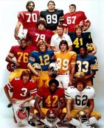
What team is #12 from?Today’s record-setting FG, combined with the arched Illini decals on helmets, made me remember this picture of Dan Beaver with other pre-season All Americans in 1976.
Cal, I thinkWhat team is #12 from?
Ahhhhh good call. I couldn't figure out the helmet logo.Cal, I think
mhuml32
- Cincinnati, OH
Slant Illinois is squarely in last.
The practicality problem is the air flo helmets make it impossible to have a logo that horizontally wide. Last week's logo had to be reduced to fit modern helmet design, which made them feel "off".
Joe Roth, Cal. Sad story.What team is #12 from?
https://en.wikipedia.org/wiki/Joe_Roth_(American_football)


Last edited: