I think you almost have to go with #2 ... at least I would!
O/B/O is worn so frequently - both now and with every uniform combo we have had since the 1980s - that I feel like I associate the
O/B/B look WAY more uniquely with old photos I have seen of that Rose Bowl season.
EDIT: Your follow-up post caught my eye right as I was typing this, so I guess we are all in agreement.

However, I could totally see the perspective where they think they have to honor the
O/B/O look on Homecoming? If you put me in charge of the jerseys, I would rock these the rest of the way. I put the special throwback helmets in
orange italic font to make those games stand out.
vs. Central Michigan: O/B/B ... honor the
1980s arched ILLINI helmets with an iconic look from that era.
at Nebraska: O/W/O ... regular road combo to emphasize it as a business trip for a winnable game.
at Penn State: O/W/O ... wear the same combo that got us the win the last time we visited Happy Valley, as well as sticking with what worked in Lincoln!
vs. Purdue: O/B/W ... hear me out! This is the game where we wear the
1960s star/number helmets, and I think we wore this combo a lot in that era. Plus, I at least want to SEE what the white pants and navy jersey combo looks like ... could honestly look really sharp, even if I do not support it being used regularly.
vs. Michigan: Red Grange Throwbacks ... duh/already announced.
at Oregon: O/W/B ... it's time for #BPOTR. Not only would this combination look mighty slick, but this sort of calls back to our 1999 upset win at the Big House. We obviously wore this combo during that win, and I think many fans probably still associate it with that epic game. Plus, it occurred at almost the exact same time of year as this Oregon game.
vs. Minnesota: O/B/O ... I think the
military appreciation helmet we are wearing probably just goes best with the standard uniform set.
vs. Michigan State: O/B/O ... regular home game vs. a team we need to beat, so we dress in our usual getup. Revenge for 2022.
at Rutgers: O/W/O ... default road uniform for a default road game, especially for an Illini team that is 11-0.
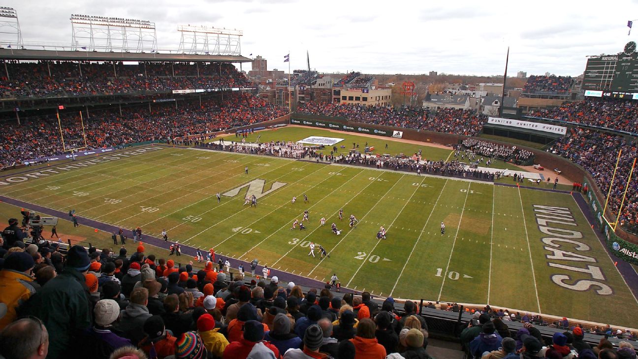
vs. Northwestern (Wrigley): O/O/O ... I'm operating under the assumption that Northwestern as the home team wears their all black "Gothic uniforms" but they also allow us to wear orange to mark it as (A) a cool neutral site game and (B) a cool rivalry game ... think of how UCLA and USC wear their home uniforms for that game no matter where they play. So, we wear all orange again to emphasize the contrast, but we flip the script a tiny bit and bust back out the
arched ILLINI helmets for some extra flair.
For any postseason play, from the Big Ten Championship to a crappy bowl in Detroit to the College Football Playoff, I say keep it classic.
O/B/O or
O/W/O. We want the millions of viewers to remember Illini football!
P.S. Someone theorized that whoever is in charge of picking our uniforms seems overly concerned about making the "tri-stripes" match on as many layers of our uniform as possible. I think this especially explains why we have seen WAY too much
O/W/W (by far my least favorite combo, no idea what they are thinking here, haha), as it has our shoulder stripes match our pants stripes. It also explains why we have seen the navy pants multiple times at home for
O/B/B (same as the
O/W/W but reversed) and of course the all orange. Lastly, it leaves us with a solid (if disappointing) explanation of why we still have not seen
O/W/B for we #BPOTR loyalists.


 I was just mainly being a bit sarcastic because I know the whole striping consistency thing was a bone of contention for a lot of folks on here, lol.