They've felt off to me since 1989.The practicality problem is the air flo helmets make it impossible to have a logo that horizontally wide. Last week's logo had to be reduced to fit modern helmet design, which made them feel "off".
You are using an out of date browser. It may not display this or other websites correctly.
You should upgrade or use an alternative browser.
You should upgrade or use an alternative browser.
Illinois Football Uniforms
Joe Roth was Heisman candidate in 1976. His coach was Mike WhiteCal, I think
Illini92and96
- Austin, TX
Ha, my favorite is block I. Can’t stand the arched. And I love the all orange we played in. Different strokes unless you don’t change your uniform for 20 years and it becomes iconic.These arched illini are awesome. Gray face mask? I’ll take it all day. Orange face masks in arched would be cool too. And ya they did update the shape slightly to fit today’s helmets, but they pulled it off. Hoping these become permanent, with a number font on jerseys that’s more blockish than the rounded ones now.
Slant Illinois looked great, and its once again associated with big success as recently as a week ago. No longer 23 years ago.
Last place is block I. Get away from that, although as long as helmet is orange with a special exception here and there, like the 100 year anniversary, I guess they’re adequate. Look like Syracuse and BTN reruns of bill Mallory’s Indiana.
That's rough man, especially the quote from The Chronicle.


altgeld88
- Arlington, Virginia
IMO the arched "Illini" is the all-time peak design.I liked the slant Illinois last week less than I thought I would, and I like these a LOT more than I thought I would.
Didn't think the grey facemasks would work but they do.
Cook
- Richmond, VA
Now with a proper placement (not low down to the ear hole), I agree. Like this center stripe with it too.IMO the arched "Illini" is the all-time peak design.
redwingillini11
White and Sixth
- North Aurora
as a former ILLINOIS helmet/logo hater, I must say this version that is just white, without a blue outline, has grown on me a lot. dropping the blue outline that was worn in like 2010 makes it much better

GrayGhost77
- Centennial, CO
Nope. Still hate it. Now the arched Illini, on the other hand...as a former ILLINOIS helmet/logo hater, I must say this version that is just white, without a blue outline, has grown on me a lot. dropping the blue outline that was worn in like 2010 makes it much better

altgeld88
- Arlington, Virginia
I've always disliked the Block "I" on our helmets. It's generic. IU has used it interminably. Ditch it.Now with a proper placement (not low down to the ear hole), I agree. Like this center stripe with it too.
I also never liked the 1980s-NY-Giants slant ILLINOIS design that Mackovic introduced simply because it was derivative and reminded me of high school teams sufficiently unoriginal that they adopt college or pro logos. I have fond memories of it and the O-B-O home kit solely because his teams (and a few that followed) were memorable.
The arched Illini is the one truly distinctive and original helmet logo we've had. I agree that where it's placed now is a dramatic improvement over the earhole-hugging design. I liked the original version bearing the Bob-Blackman-designed side stripes that he brought from Dartmouth. However, I believe that the design on the ones we used Saturday with the center stripe is cleaner, crisper, and fits with the unis better. Any helmet side stripes would be overkill given the existing shoulder stripes.
[EDIT: I also believe that arched "Illini" logo is a strong marketing icon. Would love to have that on T-shirts, hoodies, jackets. It's unique to Illinois in the way the "VT" logo is to Virginia Tech. I've spent a lot of time around VT the past three years and am astounded at how powerful a merchandising and marketing tool that logo remains for the university broadly, despite the fact that since Frank Beamer retired its football team has languished.]
I'm a big fan of our redesigned unis. Adopt that arched ILLINI on our helmets and leave the whole kit alone for as long as Iowa has left its Steelers-inspired unis alone. Yes, they're derivative, too, but they've also become a distinctive brand signature because of Iowa's (*gag*) sustained football success for 35 years since Hayden Fry showed up in IC. If only we could string together a fraction of that success.
I've always suspected that Mackovic adopted that Giants' design aping what Fry had done at Iowa a decade earlier: model the kit after a champion NFL team and success will follow. Clothes make the man, as the late Dick Gregory would argue. (As trivia, for those not around back then, in Mackovic's initial season, 1988, he removed the arched Illini decal from the helmets and they bore only a center stripe, a la the Cleveland Browns. See Howard Griffith v. Wazzu below. Then in '89 the slant Illinois and redesigned unis appeared.)
Last edited:
mattcoldagelli
- The Transfer Portal with Do Not Contact Tag
Arched "Illini" seems to really work well with modern helmet design, something that can't be said of Block I or, to a lesser degree, slant "Illinois"
mattcoldagelli
- The Transfer Portal with Do Not Contact Tag
Honestly, just take the arched Illini helmet, make the striping on the jersey/helmet consistent and replace our rebrand number font with something generic and you've got a great look that feels vintage (even though it technically wouldn't be)
/cdn.vox-cdn.com/uploads/chorus_image/image/73586010/usa_today_24231499.0.jpg)
Ya, uniforms are definitely subjective. I just happen to favor the arched. But I’d be fine with them coming out in orange hunting overalls if it meant they’d win 10 games a year.Ha, my favorite is block I. Can’t stand the arched. And I love the all orange we played in. Different strokes unless you don’t change your uniform for 20 years and it becomes iconic.
ChiefGritty
- Chicago, IL
I don't disagree tbh.Ha, my favorite is block I.
The whole package they landed on last year really nailed it.
It was the decal misalignment and border color issues that were spoiling the block I helmets, now that they've fixed that they're a solid part of a great uniform.

Last edited:
I remember thinking at the time that we had gone from the Illini to the Browns to the Giants in three years.I've always suspected that Mackovic adopted that Giants' design aping what Fry had done at Iowa a decade earlier: model the kit after a champion NFL team and success will follow. Clothes make the man, as the late Dick Gregory would argue. (As trivia, for those not around back then, in Mackovic's initial season, 1988, he removed the arched Illini decal from the helmets and they bore only a center stripe, a la the Cleveland Browns. See Howard Griffith v. Wazzu below. Then in '89 the slant Illinois and redesigned unis appeared.)
View attachment 36307
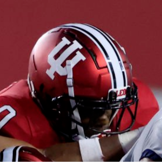
The arched Illini looked great on the modern helmets, but I am not yet ready to abandon the Block I. The arched Illini is absolutely superior to ILLINOIS and was on the helmets for 20(?) years. However, part of our branding issue is we never seem stick with a look and thus are all over the place. The Block I has and will always be there. I think about Col Henry Blake wearing the Block I sweater in the '70s on M*A*S*H a show about the '50s. The Block I has been around for well over 100 years. Indiana has periodically used a skinnier version on helmets, but they don't seem to use it elsewhere at all vs the nested IU. Maybe we should claim trademark infringement...?I've always disliked the Block "I" on our helmets. It's generic. IU has used it interminably. Ditch it.
I also never liked the 1980s-NY-Giants slant ILLINOIS design that Mackovic introduced simply because it was derivative and reminded me of high school teams sufficiently unoriginal that they adopt college or pro logos. I have fond memories of it and the O-B-O home kit solely because his teams (and a few that followed) were memorable.
The arched Illini is the one truly distinctive and original helmet logo we've had. I agree that where it's placed now is a dramatic improvement over the earhole-hugging design. I liked the original version bearing the Bob-Blackman-designed side stripes that he brought from Dartmouth. However, I believe that the design on the ones we used Saturday with the center stripe is cleaner, crisper, and fits with the unis better. Any helmet side stripes would be overkill given the existing shoulder stripes.
[EDIT: I also believe that arched "Illini" logo is a strong marketing icon. Would love to have that on T-shirts, hoodies, jackets. It's unique to Illinois in the way the "VT" logo is to Virginia Tech. I've spent a lot of time around VT the past three years and am astounded at how powerful a merchandising and marketing tool that logo remains for the university broadly, despite the fact that since Frank Beamer retired its football team has languished.]
I'm a big fan of our redesigned unis. Adopt that arched ILLINI on our helmets and leave the whole kit alone for as long as Iowa has left its Steelers-inspired unis alone. Yes, they're derivative, too, but they've also become a distinctive brand signature because of Iowa's (*gag*) sustained football success for 35 years since Hayden Fry showed up in IC. If only we could string together a fraction of that success.
I've always suspected that Mackovic adopted that Giants' design aping what Fry had done at Iowa a decade earlier: model the kit after a champion NFL team and success will follow. Clothes make the man, as the late Dick Gregory would argue. (As trivia, for those not around back then, in Mackovic's initial season, 1988, he removed the arched Illini decal from the helmets and they bore only a center stripe, a la the Cleveland Browns. See Howard Griffith v. Wazzu below. Then in '89 the slant Illinois and redesigned unis appeared.)
View attachment 36304 View attachment 36305View attachment 36307
lstewart53x3
- Scottsdale, Arizona
altgeld88
- Arlington, Virginia
The Block "I" was never used in conjunction with the football team IIRC until the Beckman era. I agree it's a potent university symbol (and love the Henry Blake reference, though I detested the way M*A*S*H depicted it's four Midwesterners, Frank Burns, Radar O'Reilly, Max Klinger, and Henry, as, respectively, a mean-spirited, second-rank prude, a naif, a gender-conflicted conscientious objector, and a happy-go-lucky dope. At least they got the Indiana part of that right in Frank Burns.)The arched Illini looked great on the modern helmets, but I am not yet ready to abandon the Block I. The arched Illini is absolutely superior to ILLINOIS and was on the helmets for 20(?) years. However, part of our branding issue is we never seem stick with a look and thus are all over the place. The Block I has and will always be there. I think about Col Henry Blake wearing the Block I sweater in the '70s on M*A*S*H a show about the '50s. The Block I has been around for well over 100 years. Indiana has periodically used a skinnier version on helmets, but they don't seem to use it elsewhere at all vs the nested IU. Maybe we should claim trademark infringement...?
Indiana has used that Block "I" on its helmets from the late '60s until the mid-'90s and off and on since. I'm now officially an Old Guy and associate it with the Lee Corso era. It's merely OK for Illinois; we already have an outstanding original helmet logo in that arched ILLINI.

Last edited:
Cook
- Richmond, VA
100% but let's update to the white face mask instead of the grayI've always disliked the Block "I" on our helmets. It's generic. IU has used it interminably. Ditch it.
I also never liked the 1980s-NY-Giants slant ILLINOIS design that Mackovic introduced simply because it was derivative and reminded me of high school teams sufficiently unoriginal that they adopt college or pro logos. I have fond memories of it and the O-B-O home kit solely because his teams (and a few that followed) were memorable.
The arched Illini is the one truly distinctive and original helmet logo we've had. I agree that where it's placed now is a dramatic improvement over the earhole-hugging design. I liked the original version bearing the Bob-Blackman-designed side stripes that he brought from Dartmouth. However, I believe that the design on the ones we used Saturday with the center stripe is cleaner, crisper, and fits with the unis better. Any helmet side stripes would be overkill given the existing shoulder stripes.
[EDIT: I also believe that arched "Illini" logo is a strong marketing icon. Would love to have that on T-shirts, hoodies, jackets. It's unique to Illinois in the way the "VT" logo is to Virginia Tech. I've spent a lot of time around VT the past three years and am astounded at how powerful a merchandising and marketing tool that logo remains for the university broadly, despite the fact that since Frank Beamer retired its football team has languished.]
I'm a big fan of our redesigned unis. Adopt that arched ILLINI on our helmets and leave the whole kit alone for as long as Iowa has left its Steelers-inspired unis alone. Yes, they're derivative, too, but they've also become a distinctive brand signature because of Iowa's (*gag*) sustained football success for 35 years since Hayden Fry showed up in IC. If only we could string together a fraction of that success.
I've always suspected that Mackovic adopted that Giants' design aping what Fry had done at Iowa a decade earlier: model the kit after a champion NFL team and success will follow. Clothes make the man, as the late Dick Gregory would argue. (As trivia, for those not around back then, in Mackovic's initial season, 1988, he removed the arched Illini decal from the helmets and they bore only a center stripe, a la the Cleveland Browns. See Howard Griffith v. Wazzu below. Then in '89 the slant Illinois and redesigned unis appeared.)
View attachment 36304 View attachment 36305View attachment 36307
Fighter of the Nightman
- Chicago, IL
For 5+ years now, fans, recruits and the college sports nation as a whole have responded astonishingly positively any time we bust out a classic or traditional look. Seems pretty damn clear to me the following are thus true:
1. We have a lot of great retro looks in our repertoire, and even folks who have no love for the Illini agree.
2. Even most of our own diehard fans hate the modern 1LL1NO1S rebrand.
The fact multiple people get paid well to stay the course indefinitely with our current branding is embarrassing, lol.
Shief
- Champaign Area
Personally, I went to school during the Zook years and liked the blue outline slant Illinois.For 5+ years now, fans, recruits and the college sports nation as a whole have responded astonishingly positively any time we bust out a classic or traditional look. Seems pretty damn clear to me the following are thus true:
1. We have a lot of great retro looks in our repertoire, and even folks who have no love for the Illini agree.
2. Even most of our own diehard fans hate the modern 1LL1NO1S rebrand.
The fact multiple people get paid well to stay the course indefinitely with our current branding is embarrassing, lol.
If we can do an orange helmet with a version of the circle ILLINI and add something below - not sure what but initially thinking Illinois state outline, player's number, or something - I think think it might look cool, white helmet alternative would be good too. Have a somewhat simple blue jersey and orange pants, orange/white, orange/blue, and white/orange combos and I think that we'd be set.
Fighter of the Nightman
- Chicago, IL
Uhm ... is Grant Smith's commitment photo showcasing both #BPOTR (i.e., O/W/B) AND the retro arched ILLINI helmet?! STOP wearing white pants on the road, and bust out this combo yesterday!!

What about adding a smaller ‘I’ just below the arched ILLINI and we can have the best of both worlds.Personally, I went to school during the Zook years and liked the blue outline slant Illinois.
If we can do an orange helmet with a version of the circle ILLINI and add something below - not sure what but initially thinking Illinois state outline, player's number, or something - I think think it might look cool, white helmet alternative would be good too. Have a somewhat simple blue jersey and orange pants, orange/white, orange/blue, and white/orange combos and I think that we'd be set.
Just like LSU helmetsWhat about adding a smaller ‘I’ just below the arched ILLINI and we can have the best of both worlds.
OrangeBlue98
- Des Moines, IA
I think this would be too busy on the helmet.What about adding a smaller ‘I’ just below the arched ILLINI and we can have the best of both worlds.
I’m no design or branding expert, but the arched early 80s style Illini on the helmet is the way forward. There are two options I see for the striping that I’ll let others debate.
1) Keep the current three-stripe and accept that coloring will be different based on the primary color of the apparel.
2) Use the five-stripe on Saturday’s helmet on all apparel. I do realize that this will look like white/orange/white on blue apparel, but at least the three interior stripes would always be consistent.
My first thought is 2) would look a little too busy on apparel, but others can disagree.