Not to open up this wound again, but you mean something like this? ... because I agree 110%:
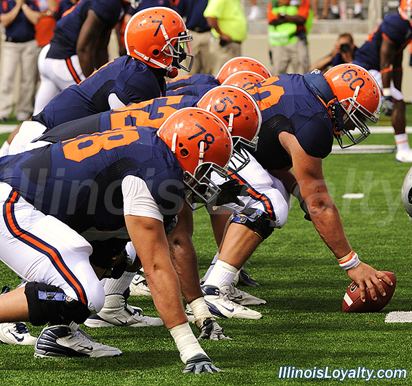
Especially those blue plants on the road (#BPOTR), baby! In all seriousness, if you gave us those shoulder stripes but combined it with our lack of a V-neck outline (which I have grown to associate with the Beckman and Lovie Eras and therefore kind of hate, lol), I would love it. With that said, I do like the current set.
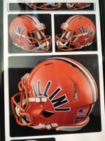
I said this above, but I could not agree more. It's the single biggest reminder of the Guenther Era for me. This sounds dramatic and silly and I am of course KIND OF joking, but it always seemed sort of insecure to plaster the
ILLINOIS (in the most unimaginative and cheap font possible) across our Block I logo. If you are going to use an ORANGE Block I logo, have the swagger that it will properly convey it is talking about Illinois without having to spell it out, haha.
Still waiting for someone talented in graphic design to mock up a Block I logo with this sort of look incorporated...
Remove the wording and numbers and replicate the columns on the bottom to create a Block I (and perhaps simplify it down a touch to be easily replicable), and I think you finally have a non-boring, non-Chief logo for us...