Fighter of the Nightman
- Chicago, IL
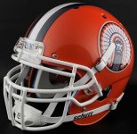
I feel like we could slightly alter the #2 striping for the different colored jerseys/pants ... but I also honestly don't think it matters if we just keep our uniform design and keep that helmet! The helmet itself IS a look ... think Michigan. No one cares or notices that they don't have that winged pattern all over the rest of their uniform. The helmet stands on its own, and I think ours would, too.I think this would be too busy on the helmet.
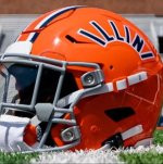
I’m no design or branding expert, but the arched early 80s style Illini on the helmet is the way forward. There are two options I see for the striping that I’ll let others debate.
1) Keep the current three-stripe and accept that coloring will be different based on the primary color of the apparel.
2) Use the five-stripe on Saturday’s helmet on all apparel. I do realize that this will look like white/orange/white on blue apparel, but at least the three interior stripes would always be consistent.
My first thought is 2) would look a little too busy on apparel, but others can disagree.
")