Illinois Football Uniforms

Status
Not open for further replies.
#1      
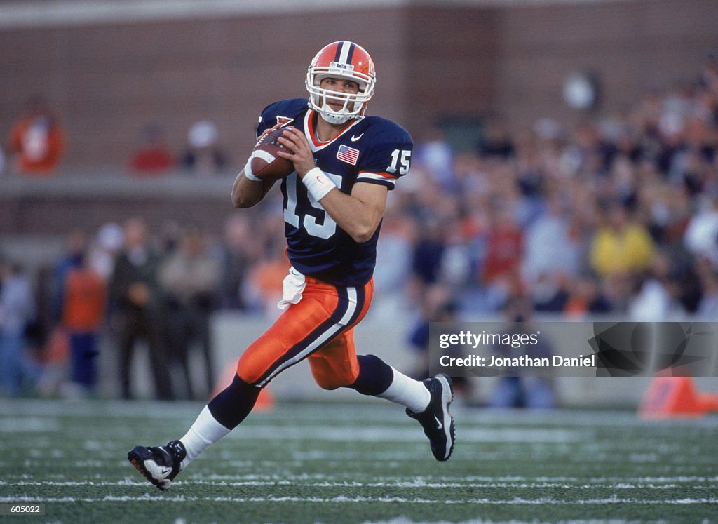
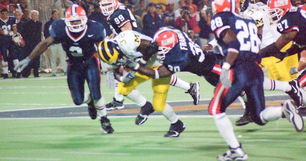
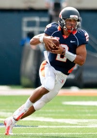
Anybody else's work slow to a crawl right about this time? :ROFLMAO: For fun, I tried to look back at every home (i.e., navy jersey) uniform combo we have ever worn during my lifetime. We have really changed up our look a lot, haha. Since there is a limit on pictures, I will post these one at a time ... MAXIMUM SUSPENSE. First, I give you the pre-Zook era:

Pre-Zook O/B/O
quarterback-kurt-kittner-of-the-illinois-fighting-illini-runs-out-of-the-pocket-looking-for.jpg


Pre-Zook O/B/B
5f0a6fce4406b.image.jpg


Pre-Zook O/B/W

27319
 
#5      
And finally the two combos we have worn with our current set (which appears to only have one orange helmet):

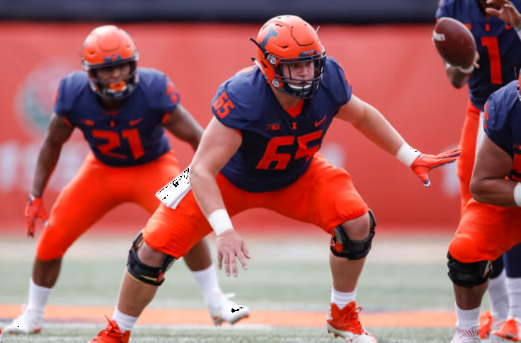
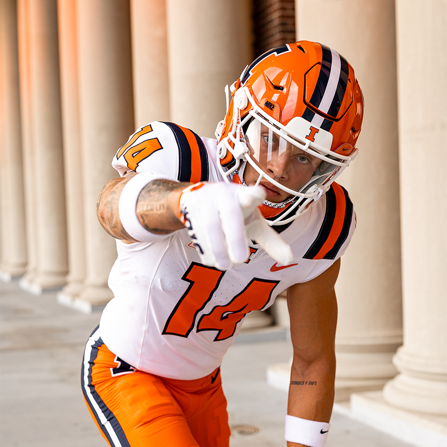
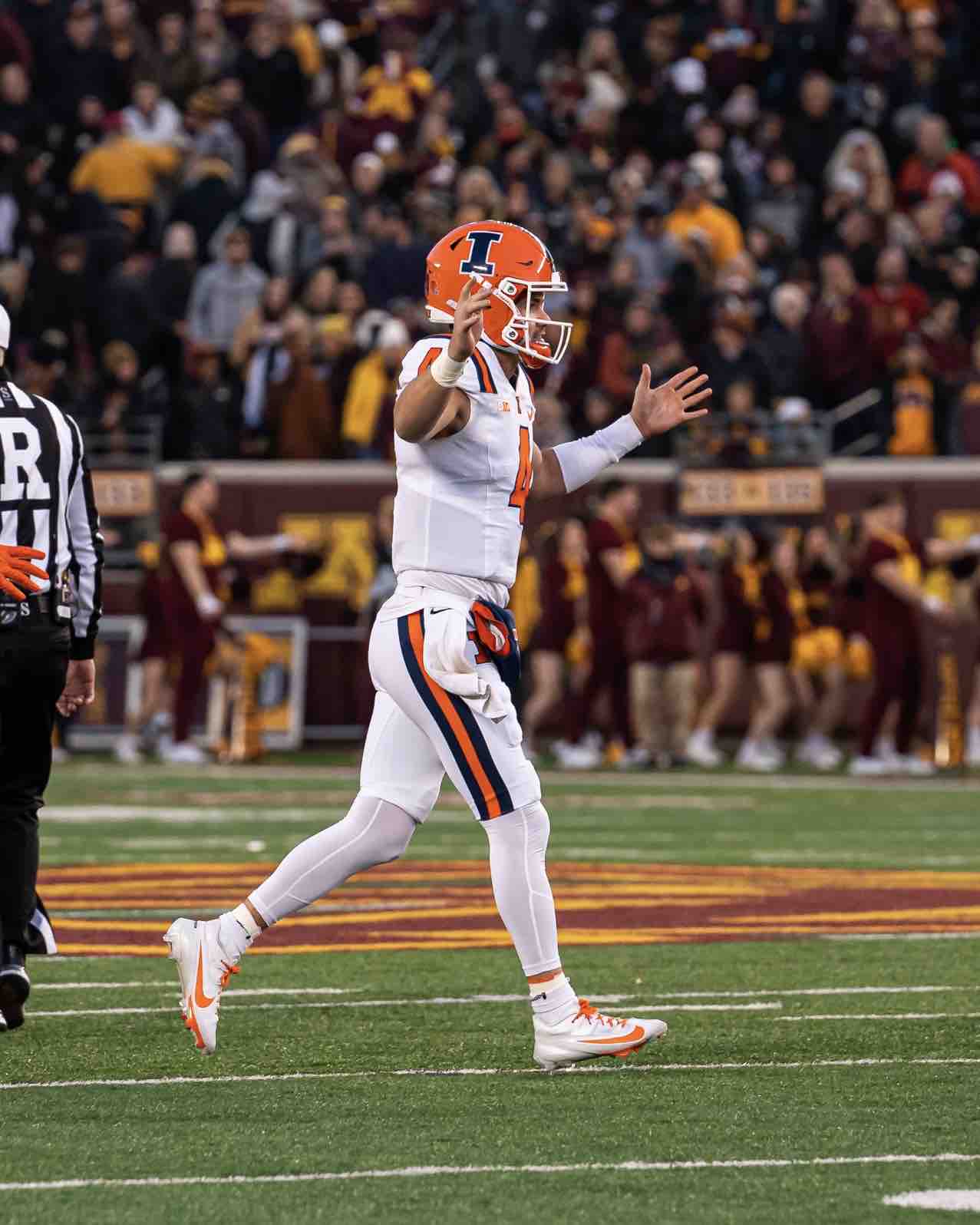
Bielema Era O/B/O
ILLPSU_12.5.jpg


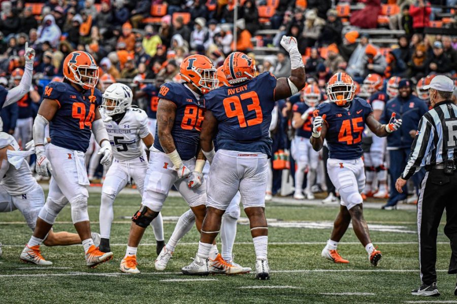
Bielema Era O/B/B
ILLNEB_3.jpg


Personally, I would like to at least see what O/B/W would look like with our new uniforms. I think these are the best jerseys we have had in a long time, though.
 
#6      

Illinir1

Camdenton, MO
And finally the two combos we have worn with our current set (which appears to only have one orange helmet):

Bielema Era O/B/O
ILLPSU_12.5.jpg


Bielema Era O/B/B
ILLNEB_3.jpg


Personally, I would like to at least see what O/B/W would look like with our new uniforms. I think these are the best jerseys we have had in a long time, though.
1. The W/B/W of the Beckman era was pretty sharp. Guess I don't remember us wearing the white helmets.
2. Your posts confirms that I didn't like anything about the Lovie era, including our uniforms
3. I like our current jerseys so much that I now own a number "50" version
4. Glad your work is slow. Thanks for the research and posting of pictures. Happy Thanksgiving.
 
#12      

altgeld88

Arlington, Virginia
The Eagles are cleansing our palates by busting out their Kelly greens again
Yep; those are sweet. I remember as a kid when they busted out the original version in the mid-'70s (not Kelly green but darker and with the silver accents). Design was a stark departure for the NFL, like the Astros in baseball (the orange rainbow jersey) at the same time. Harold Carmichael, Roman Gabriel at the end of his career. Good times.

UCLA's Dick Vermeil upset Ohio State in the Rose Bowl in '76, denying the Bucks the NC, then jumped to the hapless Eagles and had them in the Super Bowl within five seasons.

1701035351390.png
1701034995054.png
 
#13      
Just a random thought here about uniforms ... I know they just beat us, but I really don't want us to retread into the Northwestern-esque uniform routine that we employed (to a slightly less extent) during the Beckman and Lovie Eras. A little variation is fine (especially if it's what the players want), but look at the uniform combos NU wore this year ... I do NOT want this for Illinois, haha.

Home: P/P/W, W/P/W, P/B/P, B/B/P, B/B/B
Away: W/W/W, W/W/P, P/W/P, B/W/B, P/W/W
Neutral: W/P/P


I know others might not agree, but nobody can "play Oregon" but Oregon ... I don't like Oregon's uniform gimmick, but at least they dove in head first. I think it is really lame to just have the same exact uniform set and constantly switch around every possible color combo, haha. Again, just a personal opinion, but I strongly prefer when programs have a definitive "look." I believe our new uniforms have accomplished that in theory, but I think the O/W/W needs to be retired and we need pants that match one of our primary colors on the road.

Nothing but a personal wish list while I solemnly reflect on our lack of a bowl game, but I really wish we'd do something more like this next year ... the minor alterations to the uniform should be rare, cool and with some kind of purpose. The game times are obviously made up to make a point, haha:

vs. [TBD - EIU?]: O/B/O (Default for home opener)
vs. Kansas: O/O/W (Orange out game with nice weather ... but white pants this time!)
vs. Central Michigan: O/B/O (Default home)
at Nebraska: O/W/O (Default road)
at Penn State: O/W/B (#BPOTR debut)
vs. Purdue: O/O/W (Default home)
vs. Michigan: O/B/O (Gotta wear the classics for Memorial's 100th anniversary vs. UM)
at Oregon: O/W/B (Bust out the epic navy pants again since they helped upset PSU!)
vs. Minnesota: O/B/O (Default home)
vs. Michigan State: O/B/B (All blues at home as this one is at 2:30 and will get dark!)
at Rutgers: O/W/O (Default road)
at Northwestern: O/W/O (Default road)

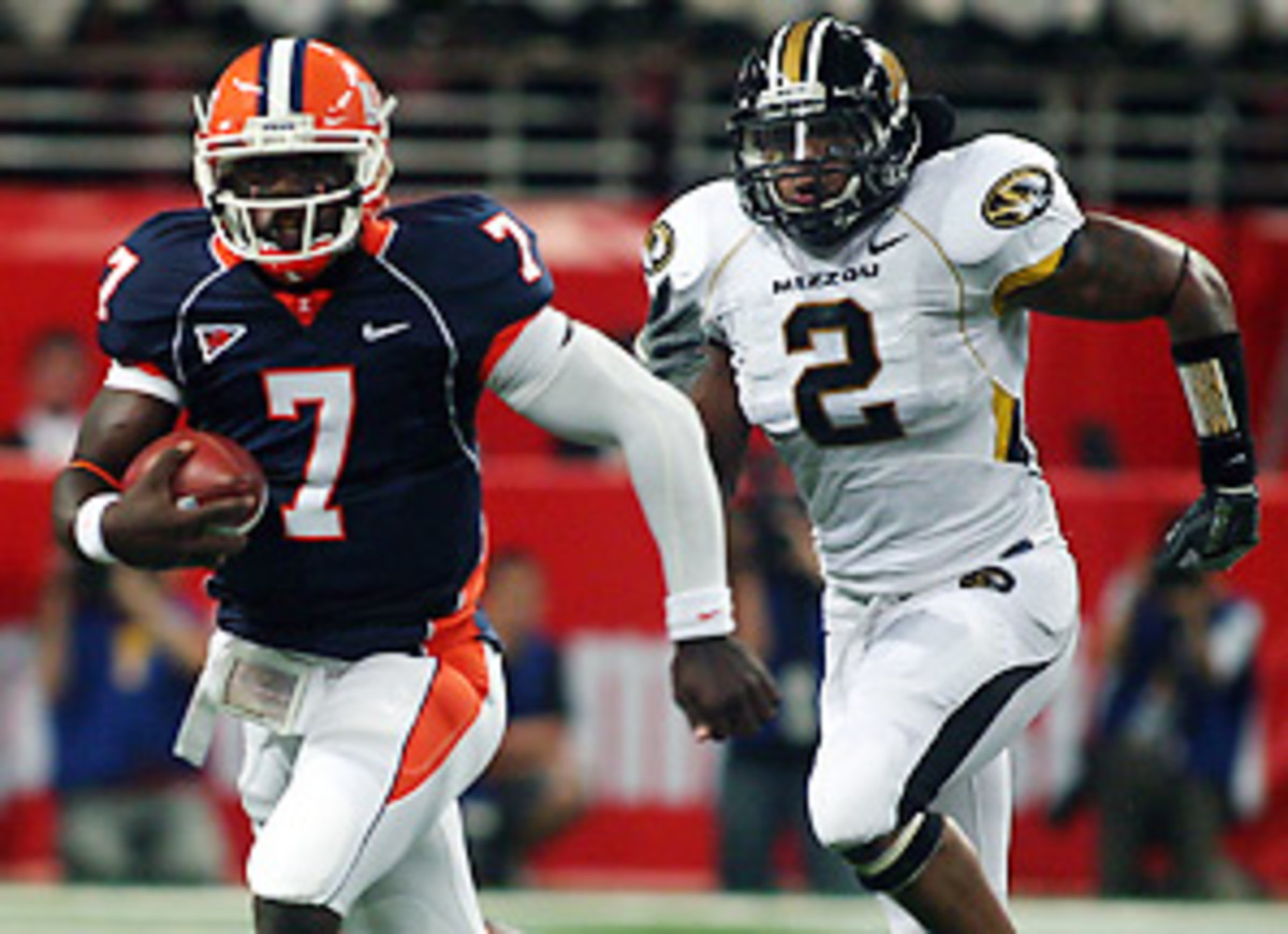
I personally think that O/B/W would look really slick, but again ... I would prefer it to be saved for something special like a bowl game or the annual Mizzou game.

Okay ... on to hoops season. :cry:
 
#14      
I learned to like the home uniforms over the season more. Both the orange and blue pop pretty well on tv and in pictures. Definitely the best orange uniform in a long time and maybe my favorite blue look as well. I still think the road with the o/w/w just doesn't work that well even though the stripes match, and preferred the old road set if they were going to do o/w/w the whole time.
 
#15      
I learned to like the home uniforms over the season more. Both the orange and blue pop pretty well on tv and in pictures. Definitely the best orange uniform in a long time and maybe my favorite blue look as well. I still think the road with the o/w/w just doesn't work that well even though the stripes match, and preferred the old road set if they were going to do o/w/w the whole time.
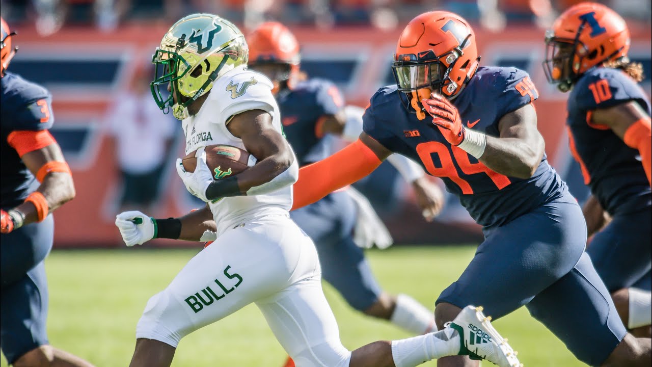
I cannot agree with your last sentence (I absolutely hated the previous set on the road in all iterations), but I completely agree with this. Of just the "mono-color" combos we wore this year, it really isn't close ... the orange and blue are WAY better than the white:

ILLNEB_3.jpg


ILL_IU_4.0.jpg


DJP_7384.jpg


I just will never dig the solid helmet plus all white underneath look on the road. We aren't Wisconsin, Tennessee, North Carolina, etc. with just one color. Throw some orange or (better yet) navy pants in there!! I know some of us were hoping for it all season to the point of annoyance, but Syracuse busted out the O/W/B look this year, and I think it looks awesome. And, of course, we already got pictures of our O/W/O combo and it WAS awesome but we never wore it...

PA3GGSH5HNE6BMR44AWKQN2YAU.jpg


F1z-LOsWIAAkfIX.png
 
#16      

redwingillini11

White and Sixth
North Aurora
I cannot agree with your last sentence (I absolutely hated the previous set on the road in all iterations), but I completely agree with this. Of just the "mono-color" combos we wore this year, it really isn't close ... the orange and blue are WAY better than the white:

ILLNEB_3.jpg


ILL_IU_4.0.jpg


DJP_7384.jpg


I just will never dig the solid helmet plus all white underneath look on the road. We aren't Wisconsin, Tennessee, North Carolina, etc. with just one color. Throw some orange or (better yet) navy pants in there!! I know some of us were hoping for it all season to the point of annoyance, but Syracuse busted out the O/W/B look this year, and I think it looks awesome. And, of course, we already got pictures of our O/W/O combo and it WAS awesome but we never wore it...

PA3GGSH5HNE6BMR44AWKQN2YAU.jpg


F1z-LOsWIAAkfIX.png
I agree the old road set was brutal. This current set of O/W/W is an improvement, but O/W/O or O/W/B would be even that much better.
 
#17      
I agree the old road set was brutal. This current set of O/W/W is an improvement, but O/W/O or O/W/B would be even that much better.
I think the key reason it's an improvement is just more blue and it looks less plain. I always got the vibe our old jerseys were chasing some weird "minimalist" trend that combined the worst aspects of being boring on one hand and yet not really traditional in any way, either. Agreed that I don't like the O/W/W, but man the new ones are WAY better, IMO:

1245186643.0.jpg


IllinoisvPurdue.jpg


I just find last year's brutal, haha. A navy outline on the number or a stripe on the pants makes a huge difference in just making it look like, ya know, we actually have two colors!! I understand I am REALLY drinking the hater-ade here, but you can barely notice the navy collar so it just looks like a plain white and orange jersey ... we aren't Tennessee.
 
#19      
^ Those are great. Pretty much swap orange with the red and our navy blue with their royal blue, and I would consider those a slight but essential improvement! I just think that stripe on the side of the shoulder looks so much cleaner than on the top of the shoulder. JMO.

EDIT: On another uniform topic, since I usually spend time critiquing ours ... I wanted to say that I think Michigan's much skinnier tri-stripe on the pants looks way worse than ours precisely because it is too skinny:

VY5Z2YN2WND7RLLTIBEVXGI2AY.JPG


F-IIVcJWUAASIWN.jpg:large


That's all!
 
Last edited:
#21      
Really wish we rocked the orange pants on the road at least once this season. Those look so much better than the monochrome whites with an orange helmet. #BPOTR would look great as well. Really confused by Bret's obsession with white pants on the road.
Agreed 110%, obviously, but I also find it weird that even though we are completely obsessed with the white pants on the road and very clearly do not care about keeping "one look" all the time ... we never tried the white pants at home, with either our navy or orange jerseys.
 
#22      

redwingillini11

White and Sixth
North Aurora
I was in a setting this weekend where the top of the athletic department was asked about the status of the Shield logo, and I wanted to pass along what I heard.

The main idea is that the DIA acknowledges that while the Shield is still officially a part of the brand, its' phase out is a result of discipline in maintaining brand consistency waining as the years go by since the 2014 rebrand, which is a natural cycle. This is due to two factors: 1) the DIA's gradual deference to the coaches' branding preferences within their programs (tennis / soccer love using the Shield; Bielema just wants a Block I); and 2) the hugely-positive response to the cursive "Illinois" "logo." As far as a department-wide decision, the Shield has not been given a vote of non-confidence.

There was also an acknowledgement that the department has been very lax in other branding instances, with the example being that the basketball team wore black team-issued sweatsuits to the Tennessee game, while black is of course not an official color. Moving forward we can expect that not to happen.

The takeaway is that both consistency and flexibility have their merits, but to balance things out, we can probably expect a "branding reset" in the next few years to bring us back to the other end of the cycle where we establish a core branding identity. Now, what this means for the fate of the Shield is unclear. It was not implied whether the Shield will be kept, eliminated, or replaced, although it seems safe to say the Shield will not be used anymore in football or basketball as long as BB and BU are in charge.

If I had to guess, because there is now an open acknowledgement that football and basketball are the necessary priority, maybe the Shield will be removed from the official brand department wide because it isn't being used in revenue sports. Although, who knows, maybe they maintain the status quo and keep it as a secondary logo and leave it up to the respective teams. I am certainly someone who prefers "brand flexibility" over "brand consistency." But it does sound like a "light reset" is coming, so some changes are likely on the horizon.
 
#24      

DReq

Always Illini
Central Illinois
Sundays MBB game was one that was perhaps primarily family oriented with students mostly gone and many old timers sitting this one out. As I sat and looked over the crowd I saw a large number of young fans with the shield on their gear. They are identifying it with the Illini more than those of us who are older (although I am one of the old group who does like it). I would tread lightly, were I the DIA marketing group, in underplaying the shield and making these young fans feel like things are changing way too often. To "go back" to previous symbols to them is to leap ahead into something new. It is mostly a comfort to the old fans but certainly not to the fans of the future. I just think that should receive some consideration while selecting a path forward.
 
#25      

TentakilRex

Land O Insects between Quincy-Macomb-Jacksonville
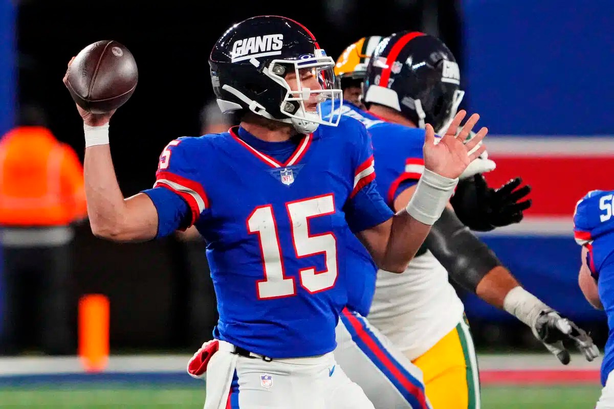
If Tommy Cutlets ends up with a Giants contract after this...next year we should 100% break out the ILLINI helmets. 🤌 🧡
Hell no, I am glad those Tuna-Crap helmets are consigned to the Dust Bowl of history. I rather have a winged helmet (pukes) than that helmet hehe.

I was in a setting this weekend where the top of the athletic department was asked about the status of the Shield logo, and I wanted to pass along what I heard.

The main idea is that the DIA acknowledges that while the Shield is still officially a part of the brand, its' phase out is a result of discipline in maintaining brand consistency waining as the years go by since the 2014 rebrand, which is a natural cycle. This is due to two factors: 1) the DIA's gradual deference to the coaches' branding preferences within their programs (tennis / soccer love using the Shield; Bielema just wants a Block I); and 2) the hugely-positive response to the cursive "Illinois" "logo." As far as a department-wide decision, the Shield has not been given a vote of non-confidence.

There was also an acknowledgement that the department has been very lax in other branding instances, with the example being that the basketball team wore black team-issued sweatsuits to the Tennessee game, while black is of course not an official color. Moving forward we can expect that not to happen.

The takeaway is that both consistency and flexibility have their merits, but to balance things out, we can probably expect a "branding reset" in the next few years to bring us back to the other end of the cycle where we establish a core branding identity. Now, what this means for the fate of the Shield is unclear. It was not implied whether the Shield will be kept, eliminated, or replaced, although it seems safe to say the Shield will not be used anymore in football or basketball as long as BB and BU are in charge.

If I had to guess, because there is now an open acknowledgement that football and basketball are the necessary priority, maybe the Shield will be removed from the official brand department wide because it isn't being used in revenue sports. Although, who knows, maybe they maintain the status quo and keep it as a secondary logo and leave it up to the respective teams. I am certainly someone who prefers "brand flexibility" over "brand consistency." But it does sound like a "light reset" is coming, so some changes are likely on the horizon.
I think the shield logo is a solid logo, it just has the bad luck of following another logo.... It is a Arizona Coyotes "Howling Coyote" logo situation.
Sundays MBB game was one that was perhaps primarily family oriented with students mostly gone and many old timers sitting this one out. As I sat and looked over the crowd I saw a large number of young fans with the shield on their gear. They are identifying it with the Illini more than those of us who are older (although I am one of the old group who does like it). I would tread lightly, were I the DIA marketing group, in underplaying the shield and making these young fans feel like things are changing way too often. To "go back" to previous symbols to them is to leap ahead into something new. It is mostly a comfort to the old fans but certainly not to the fans of the future. I just think that should receive some consideration while selecting a path forward.
If an old time logo is timeless, kids will adopt it no problem.
 
Status
Not open for further replies.