Great season and I have the can.View attachment 18918
Was going down a university beer google rabbit hole, and found the Illini inspired one from 1983 complete with our football schedule. Gotta say, I really dig the ILLINI font here.
You are using an out of date browser. It may not display this or other websites correctly.
You should upgrade or use an alternative browser.
You should upgrade or use an alternative browser.
Illinois Football Uniforms
- Status
- Not open for further replies.
Fighter of the Nightman
- Chicago, IL
I’m super excited for this day to change, but it says a lot about my experience as a lifelong Illini fan (30 years old) that I’m more concerned with getting our next uniforms right than making a bowl this year, lol.
The latter is icing on the cake in a long-term rebuild … the former is something we can control immediately and an underrated step toward creating an “Illini identity” that Illinoisans of the next generation (alumni and non-alumni like me!) could grow up having pride in to match states like Iowa or Wisconsin!
The latter is icing on the cake in a long-term rebuild … the former is something we can control immediately and an underrated step toward creating an “Illini identity” that Illinoisans of the next generation (alumni and non-alumni like me!) could grow up having pride in to match states like Iowa or Wisconsin!
While I'm excited about new uniforms, I bet the changes are pretty small based on the new turf since we're using the same fonts. But a nice brighter orange, and maybe outlined numbers, will make a huge difference (in a positive way).
I would have loved to see the cursive script used more broadly, but maybe we'll have an alternate helmet using it like we do on the basketball uniforms.
I would have loved to see the cursive script used more broadly, but maybe we'll have an alternate helmet using it like we do on the basketball uniforms.
Mr. Tibbs
- southeast DuPage
my son went to Oklahoma St, and boy would I love it if we were ever looked 1/2 as good as those guys do every weekend. They have like 10 different helmets and what seems like endless combinations of uniform colors .
It seems like Oregon and Okla St set the bar for uni's
It seems like Oregon and Okla St set the bar for uni's
altgeld88
- Arlington, Virginia
Function can indeed follow form.I’m super excited for this day to change, but it says a lot about my experience as a lifelong Illini fan (30 years old) that I’m more concerned with getting our next uniforms right than making a bowl this year, lol.
The latter is icing on the cake in a long-term rebuild … the former is something we can control immediately and an underrated step toward creating an “Illini identity” that Illinoisans of the next generation (alumni and non-alumni like me!) could grow up having pride in to match states like Iowa or Wisconsin!
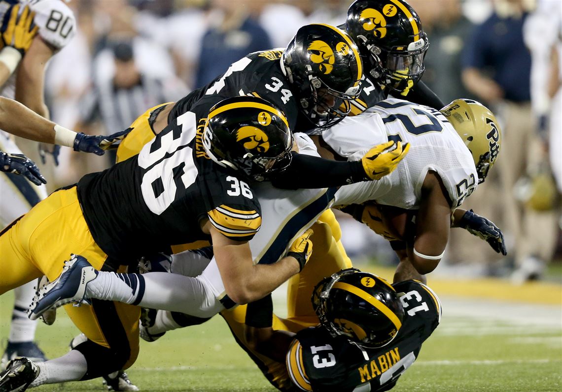
When Hayden Fry arrived at Iowa in '79, he scrapped the existing uniforms of the entirely mediocre Iowa football program and adopted the (at the time) dynastic Pittsburgh Steelers uniforms from head to toe. He also implemented the stylized Hawkeye profile on the helmet used to this day. At the time it seemed like a shameless rip-off. Within a decade or so it was an iconic college football look. Their uniforms haven't changed in 43 years.
In the BT only OSU, Michigan, Nebraska and Penn State can say that. All programs with longstanding winning lineage, even if the Huskers have declined since Tom Osborne retired. We could do worse, and have. Often.
HISTORY LESSON | "WHY THE IOWA HAWKEYES LOOK LIKE THE PITTSBURGH STEELERS"
Hayden Fry wanted Iowa to 'look like winners' so he copied the Steelers
Pittsburgh Post-Gazette

Hayden Fry wanted Iowa to 'look like winners' so he copied the Steelers
Fry gave Iowa its signature look that has stuck around for 40 years.
The Post-Gazette article is paywalled but you get the point.
I’ve a six pack of these on my entertainment center. A few years ago one of the cans leaked out the syrupy contents all over the glass shelf. Keep waiting for the next one to go. These and the 1983 Chief Pepsi bottles always get a lot of comments when people come over. I’ve always considered this a bit of a ripoff of the AC/DC font.View attachment 18918
Was going down a university beer google rabbit hole, and found the Illini inspired one from 1983 complete with our football schedule. Gotta say, I really dig the ILLINI font here.
mattcoldagelli
- Script Illinois Enthusiast
Orange helmets are so hot right now the Bears couldn’t resist
JFGsCoffeeMug
BU:1 Trash cans:0
- Chicago
Anyone else think those look terrible? Just me? Great.Orange helmets are so hot right now the Bears couldn’t resist
ChiefGritty
- Chicago, IL
1. The Bears home uniforms are some of the best in all of sports and shouldn't be touched, every variation is a downgrade.Orange helmets are so hot right now the Bears couldn’t resist
2. These are objectively aesthetically awful.
3. The NFL is like a decade late to this party and now way, way behind the trend.
mattcoldagelli
- Script Illinois Enthusiast
Anyone else think those look terrible? Just me? Great.
Very lazy and bad, yes
Fighter of the Nightman
- Chicago, IL
For some reason, I feel like 90%+ of NFL uniforms are almost "uneditable" due to how they were initially styled ... they're all more gaudy and "busier" than the best college uniforms, and all of these alternates (besides a few cool throwbacks) just look so much worse due to the baseline most NFL programs are working with.Very lazy and bad, yes
dgcrow
- Kelso, WA
The person on this board who suggested that the "C" on the Bears' helmet looks like a toilet seat permanently ruined it for me.Anyone else think those look terrible? Just me? Great.
The person on this board who suggested that the "C" on the Bears' helmet looks like a toilet seat permanently ruined it for me.

So the Bears decided to use both the old and new orange shades on the helmet? /sOrange helmets are so hot right now the Bears couldn’t resist
Couldn’t their media/PR team light the 2 photos in such a way as to make them look the same color? Was a McCaskey in charge?
Sorry. And these new helmets are beyond lazy. The bear logo is one of the best logos in sports and instead they use the toilet lid seat C, but in a different color. People actually get paid large sums of money to make these stupid decisionsThe person on this board who suggested that the "C" on the Bears' helmet looks like a toilet seat permanently ruined it for me.
mattcoldagelli
- Script Illinois Enthusiast
Or hey, it’s an alternate- get a little more creative and throw this guy on there
ChiefGritty
- Chicago, IL
I always preferred this one tbh


redwingillini11
White and Sixth
- North Aurora
No idea when this image was originally made, but the backdrop sure seems to show a lot of current marketing themes like “Hail to the Orange” and “FamILLy”. What else do we see there?
Positive sign for #TeamUnderline????
Positive sign for #TeamUnderline????
Fighter of the Nightman
- Chicago, IL
^ Good LORD, does that team actually exist?
redwingillini11
White and Sixth
- North Aurora
Yes!^ Good LORD, does that team actually exist?
soupy17
- MI
(Ctrl) U of (Ctrl) IYes!
ChiefGritty
- Chicago, IL
(Ctrl) U of (Ctrl) I

Fighter of the Nightman
- Chicago, IL
Two more quick and random thoughts on uniforms as I wait for a client Zoom to begin (lol, employee of the year!):
1) I still think we should do the classic, cleaned up look with the new orange, some script/'70s font added in, better outlining of the numbers, etc.:
Home: O-B-O
Away: O-W-O
vs. NU: B-B-W at home, B-W-B on the road and B-O-W alternates for a big game or something
All one color or mixing those should be incredibly rare. With that said...
2) If our goal is to sort of "rebrand" for a new era while still nodding to the past, that picture actually got me thinking that we could do some cool stuff with white pants. I could totally get on bored with a scheme similar to those glorious throwbacks we wore in 2008 for the home opener - orange helmet, blue jerseys and white pants, keeping it clean and classic. I am not sure what would look best on the road if we went this route, but I think this scheme would be kind of a cool combo of giving the Illini a "new look" to say goodbye to our tumultuous recent past while also looking traditional. Here is the reference for those who don't remember:

Script Illinois on the helmet instead?? Block I?? I'm open to suggestions ... but those look DAMN good!
1) I still think we should do the classic, cleaned up look with the new orange, some script/'70s font added in, better outlining of the numbers, etc.:
Home: O-B-O
Away: O-W-O
vs. NU: B-B-W at home, B-W-B on the road and B-O-W alternates for a big game or something
All one color or mixing those should be incredibly rare. With that said...
2) If our goal is to sort of "rebrand" for a new era while still nodding to the past, that picture actually got me thinking that we could do some cool stuff with white pants. I could totally get on bored with a scheme similar to those glorious throwbacks we wore in 2008 for the home opener - orange helmet, blue jerseys and white pants, keeping it clean and classic. I am not sure what would look best on the road if we went this route, but I think this scheme would be kind of a cool combo of giving the Illini a "new look" to say goodbye to our tumultuous recent past while also looking traditional. Here is the reference for those who don't remember:

Script Illinois on the helmet instead?? Block I?? I'm open to suggestions ... but those look DAMN good!
That is my dream uniform right there.Two more quick and random thoughts on uniforms as I wait for a client Zoom to begin (lol, employee of the year!):
1) I still think we should do the classic, cleaned up look with the new orange, some script/'70s font added in, better outlining of the numbers, etc.:
Home: O-B-O
Away: O-W-O
vs. NU: B-B-W at home, B-W-B on the road and B-O-W alternates for a big game or something
All one color or mixing those should be incredibly rare. With that said...
2) If our goal is to sort of "rebrand" for a new era while still nodding to the past, that picture actually got me thinking that we could do some cool stuff with white pants. I could totally get on bored with a scheme similar to those glorious throwbacks we wore in 2008 for the home opener - orange helmet, blue jerseys and white pants, keeping it clean and classic. I am not sure what would look best on the road if we went this route, but I think this scheme would be kind of a cool combo of giving the Illini a "new look" to say goodbye to our tumultuous recent past while also looking traditional. Here is the reference for those who don't remember:

Script Illinois on the helmet instead?? Block I?? I'm open to suggestions ... but those look DAMN good!
Wouldn't mind a smaller block I instead of the numbers, but this is timeless Illinois that brings back our success.
- Status
- Not open for further replies.

