Would you pay for a tattoo?I’d pay serious money to see the basketball players tape anto their head.
You are using an out of date browser. It may not display this or other websites correctly.
You should upgrade or use an alternative browser.
You should upgrade or use an alternative browser.
Illinois Football Uniforms
- Status
- Not open for further replies.
I am consistently amazed at the quantity of discourse devoted to the uniforms.
The food's not great, but the portions are fantastic!
I like those uniforms... I know the 5th grader emphasis ILLINOIS isn't everyone's cup of tea, and I like just the block I better, but I think those are clean and crisp and as you pointed out, the orange was on point. Piping was cool, half stripe on pants. It really came together well. It's a good midway point between stripes and piping on everything and what we have now (essentially a uniform with iron on numbers and names). It looks like such a late 2000's uniform, but it fits well in that time period. Also... why when I quoted you did the image change from Ferguson to Scheelhaase, kinda weird.
This is my primary (only?) issue with the uniform rebrand. The new reddish-orange looks dirty and ugly in comparison to the old orange. The previous Illini orange was so unique and identifiable that you could pick it out in a crowd of other orange hues. Paired with Illinois blue, that combo was bold, audacious, and visually striking - perfect school colors. The new colors look like Nike was trying to find a nice autumn bridesmaid dress color.
If you were to take a group of fans wearing apparel from Syracuse, Clemson, Princeton, Texas, Oregon State, and Oklahoma State, and then stand them next to someone wearing the previous Illinois colors, your first reaction might be, "Woah – Illinois is orange." These days it's, "Hey, is that Syracuse?"
Thanks, Nike.
I don't entirely disagree, but the problem with getting the old orange to look the same on different surfaces was a real thing

Clemson has that problem too, the helmets always look darker than everything else. It's amazing how little you care when you win 11 games every year.
White helmets with white facemasks are a growing scourge
The paint budget must have dried up.
I'll see myself out.
I'll see myself out.
Fighter of the Nightman
- Chicago, IL
Yep, the Zook era uniforms were very much of their time. And the OBW with the occasional OOW was a nice, simple set of combos.
Yep, other than the atrocious helmets, I was actually a huge fan of those uniforms.
wILL-INI
- Charlotte, NC
Yep, other than the atrocious helmets, I was actually a huge fan of those uniforms.
For it was the piping. It was so unnecessary, really busy-ed up some nice unis. .
For it was the piping. It was so unnecessary, really busy-ed up some nice unis. .
But the piping was the whole thing, the entire design was built on that. It was a Nike template of course, but it suited the OBW we wore so often.

I've said it before and I'll say it again, I hate the white pants. I get it if you're a school like Wisky or PSU and you only have 1 color, but we have 2. It's a very SEC/ACC look for a school with 2 colors and forsake one of them and go with white pants. Minny started doing this around the same time we did, probably a Nike thing, and it always just bothered me, can't say why though.
BananaShampoo
Captain 'Paign
- Phoenix, AZ
Agree. I might be in the minority but I've never been a fan of any combo that involved white with the unis. Our colors are orange and blue. When done alone they look really great. Start adding white, gray, or any other color into the picture and I feel like it just dilutes our brand and image (though I'm okay with teh gray ghost unis ONCE a year, if they can get the color right). Give me O/B/O or O/O/B all day every day.I've said it before and I'll say it again, I hate the white pants. I get it if you're a school like Wisky or PSU and you only have 1 color, but we have 2. It's a very SEC/ACC look for a school with 2 colors and forsake one of them and go with white pants. Minny started doing this around the same time we did, probably a Nike thing, and it always just bothered me, can't say why though.
O/B/O should be, in my humble opinion, our most used combo. I'm also partial to O/B/B reserved for big games, as that used to be the tradition when I was younger. I remember them coming out with orange pants for warm ups then taking the field in all blues right before the game started and the place going nuts.
wILL-INI
- Charlotte, NC
But the piping was the whole thing, the entire design was built on that. It was a Nike template of course, but it suited the OBW we wore so often.

With a few minor adjustments... Damn near perfect.
So you were partial to the 04-05 era unis?


Fighter of the Nightman
- Chicago, IL
Hot take o'clock: I think the white pants and/or white helmets look indisputably "better" or "more fashionable" than their orange counterparts, but I don't think that is what we should be going for. I think in order for us to at all create a sort of brand or unique, identifiable look, we should wear orange pants as often as possible. This is a very recent, newly developed opinion of mine.
wILL-INI
- Charlotte, NC
Hot take o'clock: I think the white pants and/or white helmets look indisputably "better" or "more fashionable" than their orange counterparts, but I don't think that is what we should be going for. I think in order for us to at all create a sort of brand or unique, identifiable look, we should wear orange pants as often as possible. This is a very recent, newly developed opinion of mine.
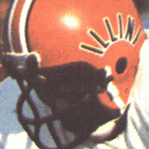
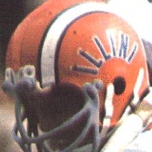
THIS THIS THIS! We've worn orange helmets for X number of years of our history. When random college football fans tune into our games, and they see us wearing grey, I guarantee you it takes them a hot minute to be like "who is this again?" Our orange helmet (white facemask) is our main identifier and has been since butkus. One Helmet. To rule them all.
Others might work and be stylish, make recruits tweet fire emojis. But its not Illinois.
Our orange helmet (white facemask) is our main identifier and has been since butkus.


The only period in Illini history we've had white facemasks was 1989-2012 per The Helmet Project
I do agree we should stick with an orange helmet.
I've always liked the curved "ILLINI" decal on the orange helmets ... I've always thought the curve gave the letters sort of a Chief headdress kind of look.
The white mask is more a personal preference. I may or may not tweet rant about it.
I love the white face mask. It is what I think of when I remember Illini games of my youth.
To me the white facemask was only to match the white slant Illinois on the helmets. Since slant Illinois is the worst thing ever, white facemasks aren't too far behind.
No way a white facemask would work with the current helmets.
No way a white facemask would work with the current helmets.
Was that really Beckman's reasoning? Not that I can't see Beckman pretending to explain that reason. Might want to tell Clemson, Georgia, and Oklahoma. Imagine how good they could be if they only knew to eliminate glare by losing the white facemasks....Beckman did away with the white facemasks. Something to do with the glare of the sun/lights.
Ofcourse that doesn't mean Lovie can't bring them back. But that was the rationale behind the switch in 2012.
Was that really Beckman's reasoning? Not that I can't see Beckman pretending to explain that reason. Might want to tell Clemson, Georgia, and Oklahoma. Imagine how good they could be if they only knew to eliminate glare by losing the white facemasks....
New coaches seem to always want to add some little tweak to the uniforms to mark their territory. Zook added the outline to slant Illinois, Beckman switched the facemasks to blue, Lovie took the stripes off the helmet, etc.
My understanding with Beckman though was that we had already initiated the rebrand process and so Thomas gave Beckman & Co the green light to just start experimenting and do whatever they wanted until the new stuff came. So there were a lot of rinky-dink changes during that period.
Yeah that makes a lot of sense with the rebrand coming. That was the introduction of the all matte blue helmet with block I (that actually looked pretty good), and of course the state outline helmet (not a fan).New coaches seem to always want to add some little tweak to the uniforms to mark their territory. Zook added the outline to slant Illinois, Beckman switched the facemasks to blue, Lovie took the stripes off the helmet, etc.
My understanding with Beckman though was that we had already initiated the rebrand process and so Thomas gave Beckman & Co the green light to just start experimenting and do whatever they wanted until the new stuff came. So there were a lot of rinky-dink changes during that period.
- Status
- Not open for further replies.

