Idaho and Iowa State have both used very similar Block I logos. The only difference is they layered an additional word ("Vandals" or "State") on top, probably because they realized the I by itself was kinda boring and nondescript.I would say more than those two. Iowa and Michigan are unique as well. A block letter, while common is generally unique. No one has a block I like ours. Minnesota’s M is different from Michigan’s and Maryland’s.
I would say the block I is good, the arched Illini unique and identifiable. Short of a cool new logo the block I will do.
You are using an out of date browser. It may not display this or other websites correctly.
You should upgrade or use an alternative browser.
You should upgrade or use an alternative browser.
Illinois Football Uniforms
I really struggle to see how the slant Illinois is any lazier than just tossing a single letter out there. Especially when we were very late to the single letter game. At least nobody else is doing the slant underlined thing right now. Tons of single letter helmets out there, and even if you narrow to only ones using block lettering, there are plenty.The problem with the slant illinois is twofold. 1.) It is a direct ripoff of the giants logo at the time, akin to the way many high school teams look. Shouldn't be too much to ask for something mildly unique? 2.) It's lazy for reasons other that that - it looks like someone typed Illinois into Microsoft Word, hit Ctrl+B, Ctrl+U, Crtl+I and called it a day.
mattcoldagelli
- Script Illinois Enthusiast
Maybe today left a sour enough taste for us to stop with the all-orange
TentakilRex
- Land O Insects between Quincy-Macomb-Jacksonville
Goofed around and made this helmet. I wanted to make a Butkus era helmet with a Block I logo.
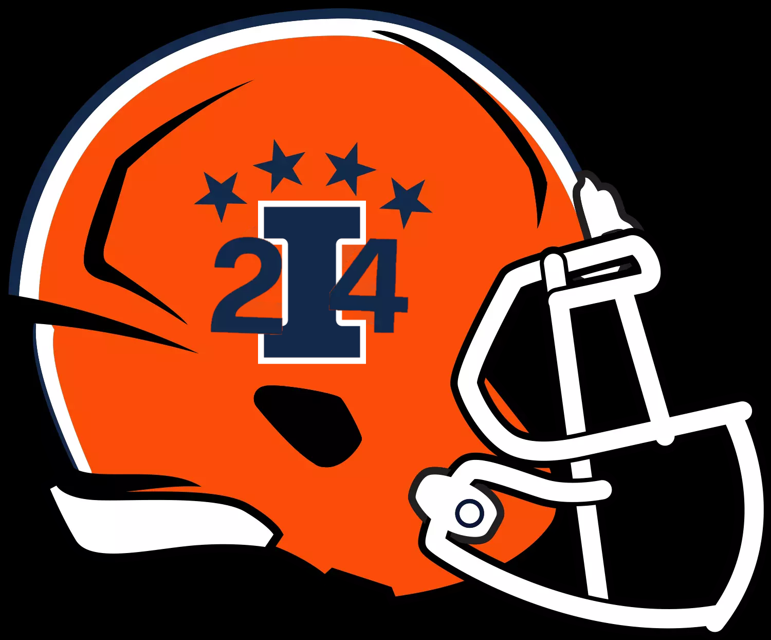
1. This is a quickie prototype, the number placement is far from perfect. This is just a proof of concept.
2. I will adjust the colors, numbers, etc on another version
1. This is a quickie prototype, the number placement is far from perfect. This is just a proof of concept.
2. I will adjust the colors, numbers, etc on another version
BZuppke
- Plainfield
The ‘only’ differenceIdaho and Iowa State have both used very similar Block I logos. The only difference is they layered an additional word ("Vandals" or "State") on top, probably because they realized the I by itself was kinda boring and nondescript.
Absolutely way too busy. Either numbers or block I.Goofed around and made this helmet. I wanted to make a Butkus era helmet with a Block I logo.
View attachment 37088
1. This is a quickie prototype, the number placement is far from perfect. This is just a proof of concept.
2. I will adjust the colors, numbers, etc on another version
Wouldn't mind rounding out the block I with a second set of star below the I similar to the helmets today
Well, your previous assertion was that nobody uses a block I. I suppose you should have said "nobody uses a block I with no other visual elements." As far as I know, yes that is true. By that token, nobody else, including the Giants, has ever used a slant Illinois, particularly on an orange background. If you're going to be absurdly specific about the block I, hold the slant Illinois to the same standard.The ‘only’ difference
TentakilRex
- Land O Insects between Quincy-Macomb-Jacksonville
Prototype 1Absolutely way too busy. Either numbers or block I.
Wouldn't mind rounding out the block I with a second set of star below the I similar to the helmets today
BZuppke
- Plainfield
I don’t like the slant Illinois. Anyone who does is just wrong wrong wrongWell, your previous assertion was that nobody uses a block I. I suppose you should have said "nobody uses a block I with no other visual elements." As far as I know, yes that is true. By that token, nobody else, including the Giants, has ever used a slant Illinois, particularly on an orange background. If you're going to be absurdly specific about the block I, hold the slant Illinois to the same standard.
Shief
- Champaign Area
What would it look like with the slant Illini on top of the block I, where the stars are? It might be cluttered but I'm curious.
Fighter of the Nightman
- Chicago, IL
O/W/B and O/O/WWhat combo haven't we lost in?
Oh yeah … we refuse to give either a chance.
altgeld88
- Arlington, Virginia
Love the all-orange. Sparingly. And only in brilliant autumn sunshine.Maybe today left a sour enough taste for us to stop with the all-orange
Fighter of the Nightman
- Chicago, IL
I think someone earlier asked about our record in each uniform since we got the new ones? It's obviously a very small sample size, and you cannot take away too much from home vs. away ... not only is it just easier to play anyone at home, but you are not getting FCS opponents on the road, lol. For obvious reasons, I excluded the Red Grange Michigan uniforms.
HOME
O/B/O
2023
W 30-28 vs. Toledo
L 13-30 vs. #7 Penn State
L 21-25 vs. Wisconsin
L 43-45 vs. Northwestern
2024
W 45-0 vs. Eastern Illinois
W 30-9 vs. Central Michigan
O/B/B
2023
W 23-17 vs. FAU
L 7-20 vs. Nebraska
2024
W 50-49 in OT vs. Purdue
O/O/O
2023
W 48-45 in OT vs. Indiana
2024
W 23-17 vs. #19 Kansas
L 17-25 vs. Minnesota
AWAY
O/W/W
2023
L 23-34 at Kansas
L 19-44 at Purdue
W 27-24 at Maryland
W 27-26 at Minnesota
L 13-15 at #16 Iowa
2024
L 9-38 at #1 Oregon
O/W/O
2023
N/A
2024
W 31-24 in OT at #22 Nebraska
L 7-21 at #9 Penn State
So out of our 12 home games...
- We wore O/B/O 6 times with a 3-3 record.
- We wore O/B/B 3 times with a 1-2 record.
- We wore O/O/O 3 times with a 2-1 record.
And out of our 8 away games...
- We wore O/W/W 6 times with a 2-4 record (including all games in 2023...).
- We wore O/W/O 2 times with a 1-1 record (both vs. top 25 opponents).
Assuming we always wear an orange helmet, the squad has refused to give us a peak at the following combos through 20 games where we did not wear throwbacks:
- O/W/B (#BPOTR, what is the holdup?!)
- O/B/W (really thought we might get this with the Butkus Era helmets and surprised it's never been matched with slant ILLINOIS to call back to the 2007 Rose Bowl team)
- O/O/W (have long been a proponent that this would look a lot better than all orange)
- O/O/B (personally, I think this would look terrible, haha)
One thing seems kind of clear, and others have mentioned this ... with the exception of the O/B/O combo where our helmet striping matches our pants striping, whoever gets to pick the uniforms each week seems to have a peculiarly strong preference for the jersey and pants stripes to match exactly. We have matched our jersey and pant colors (i.e., worn O/B/B, O/O/O or O/W/W) in 12 out of those 20 games, and we have never once not at least had our helmet match the pants stripes (i.e., O/B/O or O/W/O in addition). In other words, I guess I will stop holding my breath for #BPOTR any time soon, lol.
And just for fun on a slow day, here are some past iterations of the combos we have yet to see with these new uniforms, in the same order as above:
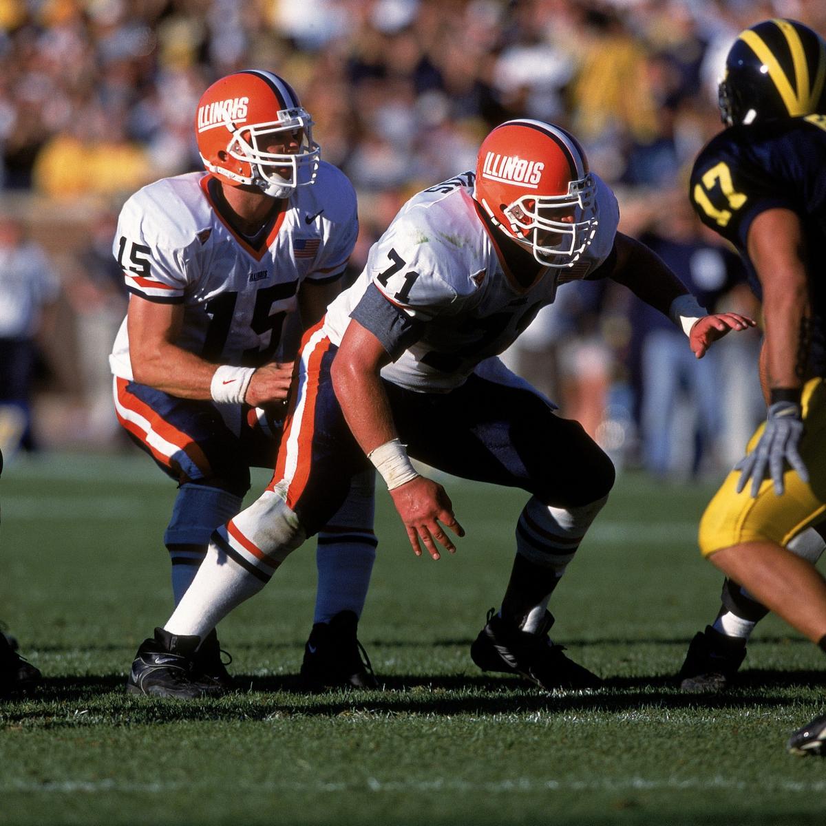
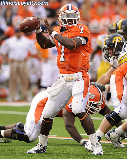


**Trigger warning, ILLINOIS appreciation incoming**
This is our best look. And that includes the helmet. 10/10, no notes.
mattcoldagelli
- Script Illinois Enthusiast
**Trigger warning, ILLINOIS appreciation incoming**
People like what they like. But the attempted rational arguments against ILLINOIS are pretty funny. There is a post in this very thread simultaneously claiming it is bad because it is a copycat and it is bad because nobody else has it on their helmets. Heads I win, tails you lose!
Fighter of the Nightman
- Chicago, IL
I'll admit I gained a new appreciation for slant ILLINOIS this year ... but I think it was just yearning for a somewhat nostalgic look. I absolutely hated it at the time (put me in the camp that it looked like RG logged into Microsoft Word and hit the bold and italic buttons to pinch some pennies), but seeing it as a somewhat "forgotten" look made me like it a bit more. I don't think "simple" or "unoriginal" is inherently bad ... I just think this look specifically ends up looking cheap and yet not that classic. JMO.People like what they like. But the attempted rational arguments against ILLINOIS are pretty funny. There is a post in this very thread simultaneously claiming it is bad because it is a copycat and it is bad because nobody else has it on their helmets. Heads I win, tails you lose!
However, I think arched ILLINI has even more nostalgia and just looks better. Of course, this is all just our tastes and preferences ... but if we want something unique and cool, why is anyone looking past the word "Illini"?! It is an objectively cool name that is inherently unique to us that we should be promoting a HELL of a lot more. It would be like if MSU never alluded to the fact they were the Spartans (another objectively awesome name unique among the Power Five) and put "Michigan State" on everything rather than their badass logo. We have a design that has "Illini" on our helmet, and I think we should choose that over the Block I or slant ILLINOIS.
P.S. The thing I will not budge on, though, is that the Block I logo with slant ILLINOIS over it was so awful. I COMPLETELY agree with those that say it's inherently insecure to choose a block letter logo and not have the confidence that it will properly identify you school. A frickin' orange and blue block I does not need our name over it, haha.
skyIdub
Winged Warrior
All of these uniform/helmet logo likes/dislikes are fun. I honestly get everyone's perspective on....most... of the combos. 
But this is 10000000000googleplex% the absolute best our all orange has EVER looked and should absolutely be in the regular rotation. The level of orange, the flow of the shoulder and pants stripe are fantastic.
I will die on this hill. I will (fake)fight anyone/everyone who claims otherwise.

But this is 10000000000googleplex% the absolute best our all orange has EVER looked and should absolutely be in the regular rotation. The level of orange, the flow of the shoulder and pants stripe are fantastic.
I will die on this hill. I will (fake)fight anyone/everyone who claims otherwise.

Fighter of the Nightman
- Chicago, IL
^ While I would prefer we try O/O/W to see if it would look better (I personally think our current white pants would lend themselves REALLY well to this look), I don't know how anyone can disagree that this is our best all orange look we've ever had ... it is not even close. The 1989-2005 uniforms looked flat-out AWFUL in all orange. The Zook Era uniforms looked pretty "meh" and looked way better with white pants. The Beckman Era uniforms just seem oddly busy now, and the orange of our helmet did not even match, haha. And the Lovie Era all orange? YIKES ... truly the stuff of nightmares.
These ones are as good as all orange could ever look, primarily because of the stripes.
These ones are as good as all orange could ever look, primarily because of the stripes.
I agree this is our best orange uniform we've had since at least the 70s, maybe ever. And like I've said previously, Bret I think likes the 90s style Illini uniforms the most so that's why we've seen the slant Illinois a lot. It also matches the uniforms. I like the other helmets more than the slant but they don't really match these uniforms which seem to be based on the late 80s-90s Illini uniforms which Bret associates our school with.
OrangeBlue98
- Des Moines, IA
This is where the whole topic is so subjective. I agree with you about using all-orange sparingly. But, I think it should only be used at night. The orange looks amazing under the lights for a night game. I didn’t think it looked as good in the daylight.Love the all-orange. Sparingly. And only in brilliant autumn sunshine.
But this is why the thread is 23 pages long now.
skyIdub
Winged Warrior
^ While I would prefer we try O/O/W to see if it would look better (I personally think our current white pants would lend themselves REALLY well to this look), I don't know how anyone can disagree that this is our best all orange look we've ever had ... it is not even close. The 1989-2005 uniforms looked flat-out AWFUL in all orange. The Zook Era uniforms looked pretty "meh" and looked way better with white pants. The Beckman Era uniforms just seem oddly busy now, and the orange of our helmet did not even match, haha. And the Lovie Era all orange? YIKES ... truly the stuff of nightmares.
These ones are as good as all orange could ever look, primarily because of the stripes.
If we did...this should be the template. IMHishO

Edit: I just realized this isn't O/O/W...it's W/O/W.
White helmet with orange slant ILLINOIS anyone??!!!
Last edited:
MoCoMdIllini
- Montgomery County, Maryland
To have the helmet orange match the jersey and pants orange is so key to this look.All of these uniform/helmet logo likes/dislikes are fun. I honestly get everyone's perspective on....most... of the combos.
But this is 10000000000googleplex% the absolute best our all orange has EVER looked and should absolutely be in the regular rotation. The level of orange, the flow of the shoulder and pants stripe are fantastic.
I will die on this hill. I will (fake)fight anyone/everyone who claims otherwise.

I don't think we have always had a good match here.

