I suppose I am sympathetic to your argument. However, on the flip side I hate when we move toward acting/dressing like orange and white our our two primary colors. This is a huge reason why I hate the current white and orange default basketball uniforms, as they have orange/white lettering with no outline on a white/orange jersey. The lack of navy gives off Tennessee vibes.
And on that note, I love that we are one of the RELATIVELY few schools in the major college sports world that have two bold primary colors (i.e., not one main color and an accent color). Looking at just the new Big Ten and SEC...
DEFINITELY DO NOT QUALIFY
Indiana (red and white)
Michigan State (green and white)
Nebraska (red and white)
Northwestern (purple and white)
Penn State (navy and white)
Rutgers (red and black/white)
Wisconsin (red and white)
Alabama (maroon and white)
Arkansas (red and white)
Kentucky (blue and white)
Mississippi State (maroon and white/gray)
Oklahoma (maroon and white)
South Carolina (maroon and white)
Tennessee (orange and white)
Texas (orange and white)
Texas A&M (maroon and white)
IN BETWEEN - LEAN DO NOT QUALIFY
Ohio State (red and gray)
Georgia (red and black/gray)
Vanderbilt (black and gold but way more emphasis on black)
IN BETWEEN - LEAN QUALIFY
Maryland (red and yellow but way more emphasis on the red)
Purdue (black and gold but gold is used as somewhat of an accent, IMO)
Washington (purple and gold but more emphasis on the purple)
Ole Miss (blue and red but a lot of emphasis on white and gray)
DEFINITELY QUALIFY
ILLINOIS (orange and navy)
Iowa (black and yellow)
Michigan (navy and yellow)
Minnesota (maroon and yellow)
Oregon (green and yellow)
UCLA (blue and gold)
USC (maroon and yellow)
Auburn (navy and orange)
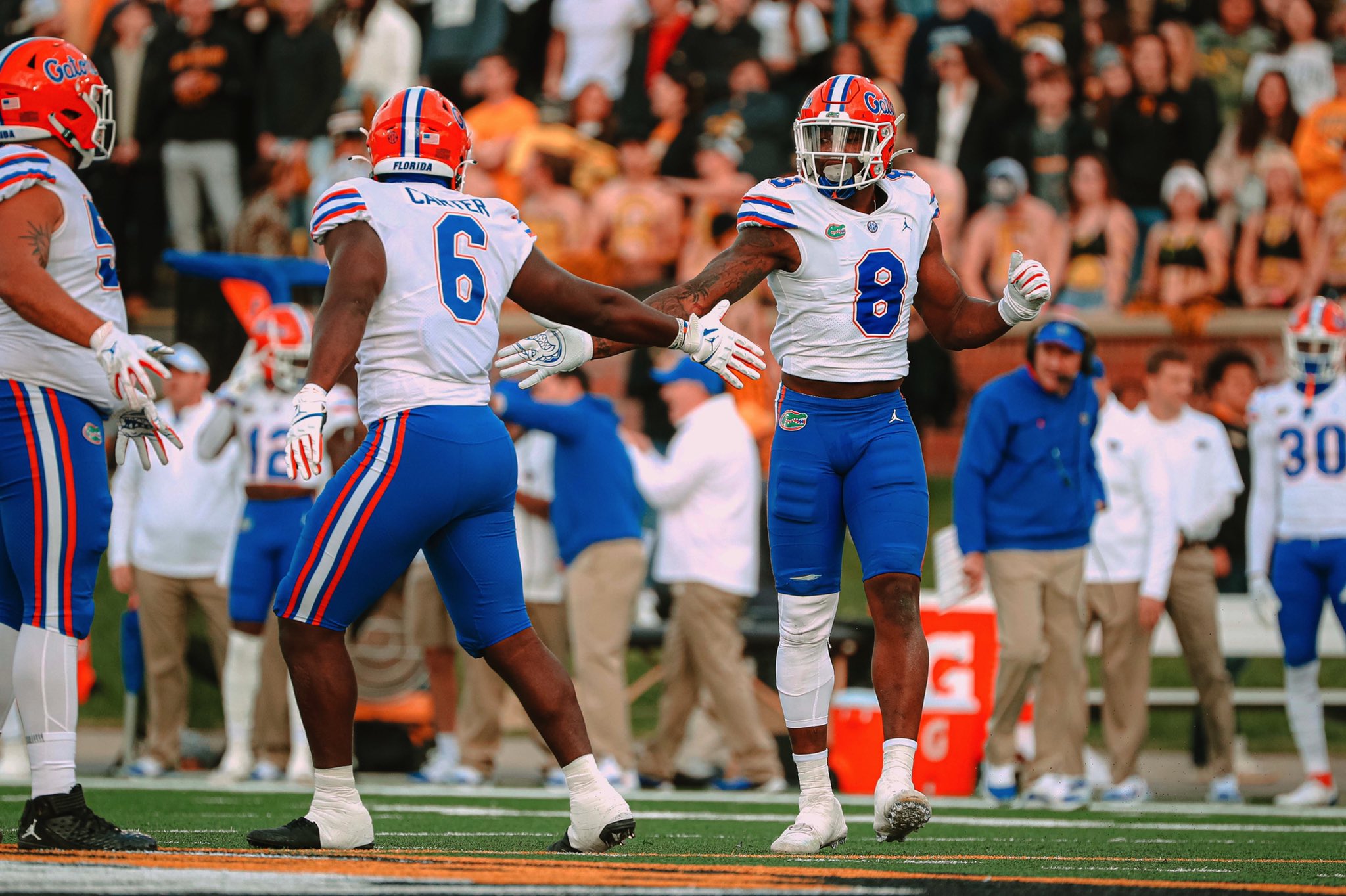
Florida (blue and orange)
LSU (purple and yellow)
Missouri (black and puke-colored gold)
And just looking at that last category, I just really personally like some of those tri-color away sets myself:
But I definitely respect where you're coming from. Personally, I think if we had navy numbers on our jerseys (with an orange outline), I would prefer the orange pants. However, with our current orange helmets and bright orange numbers on our away jerseys, there is barely any navy, whether we wear orange or white pants.

 fightingillini.com


 blue pants

 ... the white uniforms with navy pants was one of the better looks with that set:
/cdn.vox-cdn.com/uploads/chorus_image/image/60255377/usa_today_10391893.0.jpg)