Illinois Football Uniforms

#401      
Didn’t the Butkus-era team wear like goldish pants?
Always hard to tell in old photos ... I just figured they were orange (in those photos), and it was the quality of the photo that was the problem. However, they also definitely wore white pants quite a bit, as well.

On this topic (and as others have previously stated), I think we really missed an opportunity to go O/B/B for the Central Michigan game where we wore the 1980s arched ILLINI helmet. While that was before my time, I feel that look at home was pretty iconic to that era:
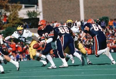
5d02670363c26.image.jpg
 
#413      
Doesn’t look good, man

[drags biggest, deadest horse out from behind barn] STOP MATCHING JERSEYS AND PANTS
I didn't dig it in the '80s and don't now (this set, IMO, is worse than 40 years ago), but lots of fans do. Whatevs. I was a fan of the orange-on-orange last year so will live with this combo.

Our blue-on-blue surpasses Michigan's, however, because of the orange accents and helmet. Maize and blue is just flat ugly and the maizer and bluer (unidirectionally) the uglier.
 
#420      
Doesn’t look good, man

[drags biggest, deadest horse out from behind barn] STOP MATCHING JERSEYS AND PANTS
I will try why it is an iffy look, it is like wearing a three piece suit with every part of it in navy blue and then deciding to wear a fluorescent orange hunter's cap with this ensemble.
 
#422      
1964 Rose Bowl. Just curious, do the helmet stars indicate class status?
When Dick Butkus was back for the unveiling of his statue, he did a Grange Grove autograph signing session on game-day morning. He signed my Sports Illustrated with him on the cover. I asked him what the stars meant: "That was something our equipment manager came up with for when you made a game-impacting play. It wasn't like today's Ohio State Buckeye helmet stickers where a player gets one if they put their jersey on the right way." 🤣
Screenshot_20241011_042726_Photos.jpg
 
Last edited:
Back