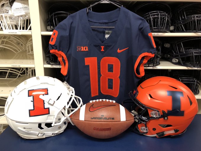
Illinois Football Uniforms

Status
Not open for further replies.
#126      
Seriously - that is unconscionable. What can we do about it? There's gotta be something. Tennessee fans stopped a head coaching hire - we've gotta be able to derail this madness that is the orange decal border on an orange helmet.
 
#127      
Yes, the orange decal border on an orange helmet is bad ... so is the white jersey with borderless orange numbers. I think all the other jerseys look good without borders though. They gray ones are actually decent looking ... I like the really basic look of the jerseys ... but I do wish the pants had some stripes on them. Overall, the new basic uni's are growing on me and I think I will like them a lot better than the beckman era first attempt uni's of the rebrand.
 
#128      
Yes, the orange decal border on an orange helmet is bad ... so is the white jersey with borderless orange numbers. I think all the other jerseys look good without borders though. They gray ones are actually decent looking ... I like the really basic look of the jerseys ... but I do wish the pants had some stripes on them. Overall, the new basic uni's are growing on me and I think I will like them a lot better than the Beckman era first attempt uni's of the rebrand.

I've always liked "basic" uniforms. They are usually pretty classy.
 
#132      
I hated them when they first came out, but after seeing that pic Im warming up to them. I think i will like the all blue the best, though I wish we had a blue helmet with the orange I
 
#137      
I visited Campus Town last week and picked up last year's jersey on the clearance rack. I figure I'll like that better than one of these new ones, and for cheaper. The jersey I got is #6. I'm guessing that's Josh Ferguson (but no name, of course). So a bit outdated.
 
#140      
These are slowly growing on me. I'll hold out having opinions on the combos until I see them in person

Sent from my SM-G930P using Tapatalk
 
#142      
I have had the same opinion since Phil Knight opened his big mouth at Joe Paterno's funeral, "Nike Sucks". And uniforms like this give me concrete evidence. I just hope they don't deter some recruits. Look is a part of the sell.
 
#146      
835805_0329_spor_ui_fball373.jpg


You gotta be ******* kidding me with that helmet logo. That is literally at a 45 degree angle. :tsk:
 
#147      
I am starting to agree that the I should just be placed on the back of the helmet.
 
#148      
This is how it's done, send to our equipment manager!
https://youtu.be/pImrXgUrmqo
So it's obvious that the Illini's equipment manager doesn't hold up the helmet like this guy does but just lays the helmet on the desk. (Would it be bad taste to tweet this link to @ILLequipment?)

With 115 helmets that get new stickers every week, I can't believe this guy doesn't have some sort of adjustable fixture to hold the helmet in place instead of holding the helmet on one hand and eyeballing the sticker with the other. I'm too much of a perfectionist for that kind of job. I would want some sort of laser guided jig.
 
#150      
So it's obvious that the Illini's equipment manager doesn't hold up the helmet like this guy does but just lays the helmet on the desk.

I think this explanation for the issue is overrated.

DgpXQ81W4AENwdB.jpg:small


Look at the helmet on the right. If you rotated the I properly, it would overlap with the buckle for the chinstrap, unless you pushed it absurdly far back on the helmet, and even then it would probably cover that back hole in the helmet.

That helmet style is the one I most frequently see, not sure I'm familiar with the one on the left. Looks like the decal could fit properly there.

But if that other helmet style is going to be in the rotation, you've got two options: make the I smaller

da26295abb4b09672e64bcd87693a9c8--football-helmets-nfl-football.jpg


Or, use a logo that doesn't extend so far to its lower corners

illini-victory-shield-badge-logo.jpg


You know where I stand :shield::shield::shield:
 
Status
Not open for further replies.
Back