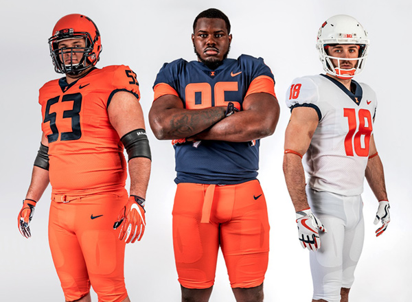
Illinois Football Uniforms

Status
Not open for further replies.
#51      
Our last redoubt may be the hypothetical hockey sweater. If there was ever a spot made for The Shield, that is it.

IIRC, the mock-up on presented when they released the feasibility study showed a sweater where the logo was a block I. Of course, this would be down the road a few years so these things change. As a member of Team Shield, I sure hope this isn't the beginning of the end. :shield:
 
#52      
IIRC, the mock-up on presented when they released the feasibility study showed a sweater where the logo was a block I. Of course, this would be down the road a few years so these things change. As a member of Team Shield, I sure hope this isn't the beginning of the end. :shield:

Ughhhhhh.

If you thought a straight, relatively narrow vertical letter was awkward on a helmet, wait til you see it on a sweater!
 
#53      
Obviously, people like what they like, and we've spilled gigs of data bickering about the merits of the Shield, but I think it's beyond debate that is it the most distinctive thing we have, at least to the segment of our fanbase that isn't playing make-believe about an old logo that is no longer used.

Agree. It was the one unique thing about our rebrand that wasn't dated and hideous the moment it came out (see 1LL1NO1S font).

I really like our football unis last year. If it ain't broke, don't fix it!
 
#54      
Our last redoubt may be the hypothetical hockey sweater. If there was ever a spot made for The Shield, that is it.
Say, something like this, though football jersey? I could get behind that bigtime. Stripes across the top of the shoulders makes the shoulders look bigger and more intimidating, and has an old school look for old school (and old) people like me. Number on front and cut for football, but yeah, the more I see this, the more I like it.


http://www.trbimg.com/img-542f8b2f/turbine/ct-illinois-no-college-hockey-spt-1005-20140927
 
Last edited by a moderator:
#57      
Is it just me, or does the orange not look right on the all orange uniform? Maybe its just the picture but idk. Other than that, the blue unis look nice and classic (almost just like the Bears) and the whites are awesome as always.
 
#58      
I am disappointed but unsurprised that all the Central Illinois boomer dads are howling about these new uniforms after they've spent a decade wetting themselves over damn near the exact same thing

ca43e187d7e4996b4ad87ce965af87f0.jpg


Would using the white pants with the home uniform make everyone happy? The Butkus-era team wore both orange and white pants, from what I can gather.
 
#59      
I don't think you have to be anti-block I to be pro-shield. I like both. The problem is an "I" just doesn't fit or look good as the prominent logo on any uniform outside of a baseball hat. The shield is unique and well sized to be a primary logo on most uniforms.

The chief is a different story. It is never coming back so we need to stop pretending everything that doesn't have a chief on it sucks.
 
#60      

I am disappointed but unsurprised that all the Central Illinois boomer dads are howling about these new uniforms after they've spent a decade wetting themselves over damn near the exact same thing

ca43e187d7e4996b4ad87ce965af87f0.jpg


Would using the white pants with the home uniform make everyone happy? The Butkus-era team wore both orange and white pants, from what I can gather.
I'm really not seeing the similarities that you apparently are. There are lots of subtle and not so subtle differences here, and the retro one is still way way better.
 
#61      
I'm really not seeing the similarities that you apparently are.

The jersey is EXACTLY the same. Wear the white pants with the blue jersey and the orange helmet and you're 96% of the way there, then 99.3% if you get gray facemasks.

I would make mean, dismissive inferences about people's obsession with throwbacks for the sake of throwbacks, but I honestly do not understand it at all. Especially in football where the nature of the uniforms and pads and all that has changed so radically. A 2018 football team can't look like a 1963 football team no matter how you design the unis.
 
#62      
The Chief logo looks bad anytime it's used in a small format don't @ me.

I wouldn't want the Chief logo anywhere on a uniform, especially football where his face would get rubbed in the turf.
 
#63      
Hoo boy the Circle I on those hockey unis is real bad.
I agree. It would be moot, anyway, because that's where you'd put the number. I was just talking about the overall look adapted to a football design. I like the shoulder stripes.
 
#64      
I like them, as a big fan of those '08 Renaissance throwbacks. Couldn't get much simpler. The collision with Syracuse seems all but inevitable to me given the school colors.

I wouldn't mind a pants stripe, but besides that? A lot to like here. No busy collars, orange numbers on the blue jerseys, no more metallic helmet paint - checks all the boxes for me.

Thinking back to how long we had to trot out those hideous Brasic-era jerseys (I think 2006-2013?), it's great to see an incremental upgrade to the new Nike uniform templates. Suggests to me that JW actually cares about staying current, and I now expect basketball to follow suit with some tweaks this fall.
 
#68      
Orange helmet looks to be an improvement, orange border on blue Block "I" appears to be metallic and may not look as bad in sunlight or under the lights as it does in these pics. Other than that, not excited. I'm one of those old farts who wouldn't mind seeing the straight retros become main uniform option.
 
#69      
i thought the football unis were the best part of the rebrand - didn't think those needed a facelift this quickly, but oh well. orange #s on blue jerseys = good, blue logo on orange helmet = :hurl: I think they would have been better off ditching the Grey homecoming unis in favor of the butkus era throwbacks, if honoring him was truly the reason for the change

Also - i really liked the vertical stripes the old jerseys had - they were subtle and unique. Wish those were still incorporated in this new set
 
#70      
The pants just need....something. A blue, orange, blue stripe down the side or something. It's just too minimalistic on the pants.
 
#71      
Hoo boy the Circle I on those hockey unis is real bad.

For B1G teams, Michigan, Notre Dame, Michigan State, Wisconsin and Ohio State all have no logo on their jerseys and just have the school name in a font on the jersey. Michigan and Ohio State's was normal, while Notre Dame's, Wisconsin's, and Michigan State's are a special hockey only font. Only Penn State and Minnesota have logos. I wouldn't be opposed to something like the font only choice, with the block I or shield on the shoulder like Michigan State. Maybe a font similar to Notre Dame's current font. Of course, we are trying really hard to have the font the same for every sport, but modern fonts look dumb on hockey jerseys imo.
 
#72      
The pants just need....something. A blue, orange, blue stripe down the side or something. It's just too minimalistic on the pants.

I mean, the rebrand gave us a stripe that was supposed to connect and unify the entire brand. And yet, now we have unis completely void of any stripes.

Coaches have too much power over the aesthetic. Case and point, the majority of this rebrand was dictated by Beckman and Thomas...
 
#73      
I feel like as sensationalized as the rebrand uniforms were with all their Nike explanations, they at least appeared unique to Illinois. I understand upgrading to the new technology of the new Nike templates, but this just seems like there was no thought involved. Just look at other new uniforms like Washington State. It's like Nike just has a standard generator. Enter team font and colors and out pops 4 uniforms: team color 1, team color 2, a white, and a gray. Looks extremely generic outside the number font.
 
#74      
These new uniforms are bland, boring, lack any feature that is distinctively "Illini" and make us look like Syracuse.

But if the kids like 'em, and win more games, I could care less.
 
Status
Not open for further replies.
Back