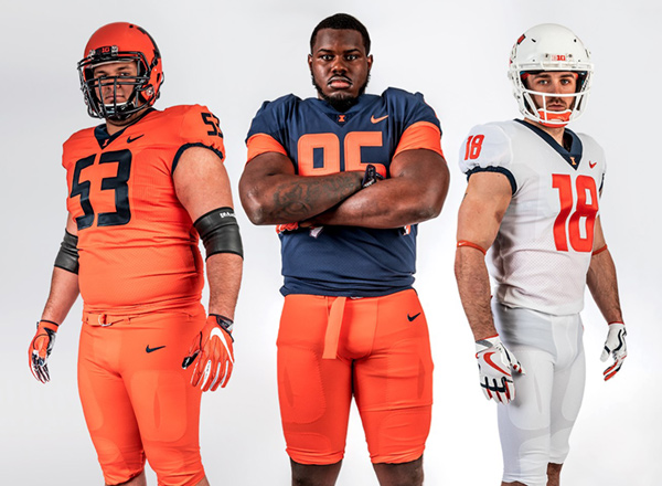
Illinois Football Uniforms

Status
Not open for further replies.
#8      
Looks a lot like Syracuse’s set.


+1

The uni set from the last couple years was clean and classic but still popped. I’m afraid this new set will be too bland and look too similar to Syracuse. Need to avoid the monotone combos. Definitely not sold on these.


Sent from my iPhone using Tapatalk
 
#9      
Hoping the orange will look a little better with contrasting pants, but otherwise I love them. First thought was Butkus era.
 
#11      
I like these, they're just not an upgrade IMO.

This is kind of where I am. If these came out as the rebrand, I would've liked them, but design-wise these are a downgrade from what we have now.

I say "design-wise" for cosmetics. I'm assuming these are the more current/advanced Nike template.
 
#12      
I like the new non metallic helmet, but could have kept the rest of the uniforms the same.

I'm also sad to see the I replace the shield on the front of the neck.
 
#13      
A few thoughts:

1. It does look a lot like Syracuse, though at least we don't have their goofball number font. Theirs push modern while ours push classic despite the very similar design.
2. Is the blue helmet now exclusively for Gray Ghost purposes?
3. You can really see that they didn't want to change our current white jerseys which are a thing of beauty.
4. My biggest complaint: the blue block I on an orange helmet needs to be bordered in white! The white block I on our previous orange helmet was kind of askew from the rest of the package, and now that orange border on an orange helmet looks even worse. It's just decals, fix this!
5. Josh Whitman is clearly not Team Shield :(
5a. You can bet the more minimalist design aesthetic here is going to carry over to our basketball uniforms too. Here's guessing the typefaces will be unbordered on those too.
6. All in all, it's fine. The problem here is that the old ones were better, but if we're being honest, it was clear Lovie was less willing to dabble in some of our better combos anyway. I'd rather have a 59 year old Texan football coach's uniform aesthetic and be coached by Lovie Smith than look awesome and be coached by Tim Beckman. And if these were what had replaced our earlier aimless mishmash, it would still be a big step forward.
7. Seriously though, fix the damn Block I bordering. If you're that committed to two-tone, use the all-blue no-border block I that's in the branding scheme.
 
#14      
The matte orange helmet paint looks much better than the metallic (or whatever it was) paint the past few years.

I agree that the Block I should be bordered in white.

I'm definitely cool with no :shield: on the uni's or helmet.
 
#15      
Yeah I guess my biggest complaint is how to tie in the minimalist design to the helmet block I. The border on the block I is somewhat important to the rebrand. They made is thicker, with the rounded inner edges. If they use the monotone block I, it kinda defeats the rebrand and looks extremely boring. In all honesty, having the shield on the helmet would actually probably match the jersey style better than an outlined block I, and look better than a monotone block I.

Thinking about it more, another option for the helmet I is to have it as only an outline. So the orange helmet would have an orange I outlined in blue. Maybe I'm just weird but I think a white outline on the helmet would look out of place as there's no other white on the rest of the dark uniforms.
 
#17      
DaGn0WyU0AECxuh.jpg


Needs one simple change. We need to go back to the white masks.
 
#18      
A few thoughts:

4. My biggest complaint: the blue block I on an orange helmet needs to be bordered in white! The white block I on our previous orange helmet was kind of askew from the rest of the package, and now that orange border on an orange helmet looks even worse. It's just decals, fix this!

Completely agree on this. Like you said, it seems they are going for a minimalist design which it appears has eliminated all of the white accents from the orange & blue uniforms. With that in mind, I can understand why they chose this combo.

But, I think it looks awful. Either make the outline navy & the inside of the "I" orange, or make the entire thing Navy. Other than that, I think this new uni set is fine.
 
#19      
A few thoughts:


4. My biggest complaint: the blue block I on an orange helmet needs to be bordered in white! The white block I on our previous orange helmet was kind of askew from the rest of the package, and now that orange border on an orange helmet looks even worse. It's just decals, fix this!

7. Seriously though, fix the damn Block I bordering. If you're that committed to two-tone, use the all-blue no-border block I that's in the branding scheme.

Agree completely. All of this is awful.
 
#20      
These are not good... but the good part is we will lose a bunch of games next year, burn these jerseys and start over with this remarkable recruiting class with sweet unis for 2019
 
#21      
:shield: is on the neck of the Grey ghost uni.. You'll never see it unless you're up close..but it's not completely gone from these uni's. Also if you put the gloves together it forms the :shield:
 
#22      
More thoughts as more pictures are posted.
1. The blue and white uniforms are good. Blue jerseys with orange or blue pants is good. White jersey would look good with any color pants.
2. The orange jerseys just don't do it for me. Not sure why. Maybe it's the Syracuse thing. I don't think this will be much of an issue though as I bet Lovie will wear the blues for nearly every home game.
3. Kinda worried about the helmets. Each helmet picture is different than the next. Facemask colors, different finishes, different block I styles. I worry that they'll play around too much with the helmets and it'll look completely out of place with the minimalist uniforms. I also worry that the orange helmet will look really bad which kinda sucks since it's been our primary helmet color for years. Based on the new uniform designs, to keep continuity, I think you can not use white on the orange or blue helmets.

The way I would design/change the helmets:
Orange helmet: blue facemask. Orange Block I with blue outline.
Blue helmet: blue facemask. Blue Block I with orange outline.
White: white facemask. White block I with orange outline.

I think that keeps the theme consistent. Only 2 colors used on each piece of equipment.
 
#24      
I think orange-blue-orange is our true north but I agree that some white ought to be worked in there somewhere. Could be subtle but white striping, outlining, something. I'd say the Tony Eason era uniforms (like them or not) is our historical median. And even Butkus's hat had white stripes, so ... These seem non-canon to me, especially the navy logo on orange helmet with navy face mask.
 
Status
Not open for further replies.
Back