Illinois Football Uniforms

#326      
ILLINOIS is the WORST why keep trotting it out? Just stop ffs 🤬
Nope. Slant Illinois still sucks despite the wins (although I hate it slightly less). I'm fine with keeping the Block I as our main helmets or going with curved Illini, or at least using curved Illini every so often for special games. Maybe just use Slant Illinois for when we play Nebraska. ;)
Totally disagree... Give me some 'By the River gently flowing 'Illinois'...
 
#327      
Slant “ILLINOIS” and new arched “ILLINI” should be the regular rotation forever.
End of debate.

Toss in the others (rwb block I, 50s Butkus..etc) here and there.
And toss the arched 'ILLINI' also...
 
#328      
Have we ever worn navy blue helmets?
Yup

IMG_6959.png
 
#332      
Also had a Beckman Era version:

iowa-hawkeyes-fullback-drake-kulick-45-tackled-1500w-7449291c.jpg


P.S. The uniform combos with the Beckman Era uniforms and the first couple years of the Lovie Era uniforms were so insane, lol. From what I can tell, we wore all of:

O/B/O
O
/B/B
W/B/W
B/B/B

O/W/O
O
/W/W
O/W/B
W/W/O
W/W/W
W
/W/B
B
/W/W
B/W/B

O/O/O
O
/O/W
O/O/B
W/O/W
W
/O/O


I could be wrong about this, but I actually think we did not wear navy jerseys once in 2014 ... o_O:unsure: And while I am a strong believer in establishing an identity through only wearing a few combos and having a clear "look," I have to admit some of the weirder combinations looked great in isolation ... they just didn't look like "Illini football," and that was a problem, IMO:

usa_today_10391893.0.jpg

convert
 
#333      
Blue helmets suck.... But as FOTN said, in isolation, some of those combos work! The B/B/B needed the white center stripe on the sleeve and pants to look it's best. But I wholeheartedly agree, we need to establish THE Illini look home/away/etc. and have a handful of variances for honoring the past(anniversaries, memorials, players, etc./military/state/etc....
 
#336      
Have we ever worn navy blue helmets?
Unfortunately yes. Hard hard no. To me the most important aspect is the orange helmet. Some prefer block i and some, like myself, do like the slant Illinois over the block. But the most popular here seems to be the arched illini, which is my favorite as well.

As long as helmet is orange, I won’t complain. At least very much. Blue, gray or even white helmets… I’ll consider writing a letter to some congressman in Illinois, even though I don’t live there expressing my disappointment.
 
#341      
It's totally ok/normal to just not like something! People should just say that, instead of rationalizations like "but this looks like Syracuse!!1111one"
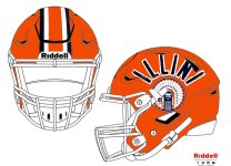
On another note, we all also have our own "fan baggage" that informs our opinions. While I have pictures of Baby Fighter wearing Illini clothes at like age 2, the first real Illini sports season I can actually remember watching multiple games is our 2002 campaign. So, I came of age as an Illini fan RIGHT as we were starting to fully sideline the Chief logo (objectively unique and intricate compared to most in college sports) and replacing it with the Block I with slant ILLINOIS across it. I just remember thinking it was such a stark switch to something so much less cool, lol. I know we adopted slant ILLINOIS way before 2002, but it seemed that as late as 2000 and even 2001, we were seeing the Chief on broadcasts for our logo and stuff; it seemed that all stopped right around 2002 or so.

I think only being exposed to all of the tradition of the Chief and whatnot from 2002 to 2007 and then seeing it removed when I was a freshman in high school created a unique hatred for me of our post-Chief identity at that time. It's why I was relatively desperate to love the Mike Thomas Era rebrand ... at least it would be a solidly fresh start where we might create a permanent look. Looking back, I cannot believe I didn't hate the 1LL1NO1S font immediately, but hey, hindsight is 20/20!

I also always liked that we were one of the Big Ten schools that didn't just have a letter for a logo, and then we joined that club at full speed and adopted one of if not the most boring iterations of a block letter, haha. For whatever reason, I developed my own pet belief that if you should do one of two things with a logo for college sports:
1. Have an ACTUAL logo like the Chief or Iowa's Tigerhawk.
2. If you are going to have a block letter, do NOT type out your school name over it. Whereas Michigan's arrogance radiates out from a plan Block M that they assume everyone will recognize because "They're Michigan," our Block I with slant ILLINOIS across it just seemed oddly insecure to me, like we had to remind everyone that an orange Block I referred to Illinois. I guess it just seemed like even we thought we were irrelevant enough that we had to spell it out for everyone, lol.

TL;DR

I guess after some soul searching, my issue isn't so much with slant ILLINOIS on our helmets, and I certainly think they have looked a lot better to me this year ... maybe even better than the usual Block I (but absolutely nowhere near as cool as arched ILLINI). It's more PTSD of our awful Block I plus slant ILLINOIS logo that was the immediate predecessor of the Chief and just seemed to be the epitome of lameness to me. As has been discussed in this thread, brand consistency is important ... but that doesn't mean we can't mix and match with our past. I have no issue with a classic helmet for football or a throwback jersey for basketball that doesn't match, say, our baseball, softball and soccer uniforms. Wear what looks cool and looks like US, within reason!

P.S. I've harped on this before, but I find the minimalist trend of the past several years so disappointing ... and I am optimistic it will start to swing back soon, because I see a lot of comments on social media from younger fans that ALL think the more retro look is way cooler. Nobody wants the minimalist crap anymore. Below is an example of some unfortunate changes in the Big Ten, acknowledging that some of these are just secondary logos, too. Each school lines up with the one above it to show the contrast.

Actual Big Ten Logos

2495.gif
74352692006.gif
w7n08iftauae3h6rhueh.gif
2889.gif
v09xq9u6a1vi6k0xz1ku.gif


Block Letter Big Ten Logos
70667022022.gif
74354442012.gif
75175572010.gif
78733582012.gif
80966442012.gif
 
#342      
Also, relevant question uniforms ... did we change our color orange?? I remember a couple years ago someone linked to this site that has the RGB codes that allow you to replicate each school's colors exactly. I remember someone commenting that Illinois' orange looked really red, and I agreed. Well, while looking up those logos on this site, I noticed that in 2022 they had our Block I logo switch from a seemingly more red orange to what I would consider a more natural one:

70683592014.gif
70667022022.gif


I also first noticed this during the KU game at night, but it does look like we FINALLY fixed that weird tangerine orange in the end zone, lmao. Really hard to find a good picture, but...

d50ee7_6544b064935b49cfaa5894d6025777d1~mv2.jpg

Test Pic.jpg
 
#344      
This seals its fate for me, lmao. Even our current "boring" Block I has the added curved edges that makes it look like someone at least tried, even if that try was tainted by the minimalist trend of our era. JMO, but arched ILLINI is the best of both worlds ... a throwback to an earlier era that looks "deliberate" or "intentional" in a way that slant ILLINOIS simply does not. If I get some free time this week, I might try to create it using EA Team Builder, but my dream jersey at this point is an updated version of these 1980s ones as it relates to the helmet and striping on the sleeves (but move them up and remove the sleeve number)...

83-o-line-jpeg.36341


but stick with this pants design:

1806665046.jpg
I was done at "Go Cowboys"
 
#345      
2. If you are going to have a block letter, do NOT type out your school name over it. Whereas Michigan's arrogance radiates out from a plan Block M that they assume everyone will recognize because "They're Michigan," our Block I with slant ILLINOIS across it just seemed oddly insecure to me, like we had to remind everyone that an orange Block I referred to Illinois. I guess it just seemed like even we thought we were irrelevant enough that we had to spell it out for everyone, lol.
This, you took the words right out of my mouth regarding the insecurity feeling that logo screams to me. Except for me it's less the association with the Block I and more the underlining of the word.
 
#348      
The hardware would have to cover up the chief a little bit, but I do like it.
This is close to what I was envisioning. I know that the Chief isn't coming back but the arched ILLINI and a logo below looks awesome. Because no Chief, that's why I wonder if an outline of the state or the player's number would be a good option.
 
#350      
Penn State is wearing their Generations of Greatness” uniforms this weekend, so we’ll see these even though they’re calling for “white out energy” (which, I’m assuming, means they want everyone else in white even though they won’t be).

IMO you gotta wear O/W/O like last week to really pop.
 

Attachments

  • IMG_1926.jpeg
    IMG_1926.jpeg
    1.1 MB · Views: 41
Back